
A recent blog post, from a well-respected source that shall remain nameless, gave some tips and tricks on how to pick paint color. You’d think this is a simple topic, but I actually cringed when I read the advice listed. The talented designers in the article gave some suggestions that were, in my opinion, how NOT to pick paint color, rather than how to choose paint colors well. (None of the designers are referenced or quoted here, even though their work is actually phenomenal.)

Picking paint color is nuanced and finicky and subjective. I’ve done enough color consultations in my life to know how the tips and tricks in the article – especially tip #1 and tip #5 – will be misused or misunderstood by most homeowners. They might work when a homeowner is working with a skilled interior designer who can keep them from making serious mistakes. But without professional guidance, I’m afraid that the five suggestions on choosing paint colors will actually leave homeowners more confused, or even worse, lead them to make bad choices.
Before I tackle each suggestion below (especially the last one – it’s a doozy), here’s the underlying reason why I think these five tips fall short:
Picking paint colors for something large-scale (your home) is vastly different from choosing a color for something small (a chair fabric, say, or a blouse to wear).

Paint colors on your walls cover the largest surface area in the room, so you have to evaluate the color differently when making your selections. Your room’s paint color will cover a LOT of vertical square footage.
Gathering a bagful of paint chips from the paint store and laying them out flat on your table is many homeowners’ first mistake. Gazing at all the pretty paint chips, you might pick a color that’s perfect for an accent pillow on your sofa, but looks wrong when it covers the whole room. The amount of surface area that a color covers will affect your perception of that color, and of the entire space. Use large, well-painted boards to select paint colors, in your own home where you can evaluate the whole effect. And hold or tape them up vertically! They’ll look very different up on your wall than on your table.
How NOT to pick paint color:
1. Use your closet for inspiration.
Try this, and you might pick a strong, intense color from your favorite scarf, rather than the more muted, sophisticated tones that most interiors need. Unless you’re working with a skilled designer, I actually think the clothes in your closet are not the best source of possible paint colors.

Your closet probably has some dark neutrals (black, mostly), a few light neutrals (white or off-white), and then plenty of brighter, saturated colors. The light and dark neutrals may be good interior paint colors, but the brights? Odds are you wouldn’t want to paint your living room in emerald green (the rich tone of one of my favorite blouses), or pale lavender (unless it’s a nursery), or a claret red (another fave).
Some strong colors are almost neutrals, like a rich navy, but most fabric colors are just too intense to envelop a whole room. This is one of those “Don’t try this at home!” things. Unless you’re working in tandem with an interior designer who understands strong color, or you have a bold, maximalist style, neutrals are your best bet.

However, the clothes in your closet can provide some useful guidance, by showing you which undertones you prefer. Seeing that most items in your closet are warm-toned or cool-toned can be useful when picking paint color. If you’re a redhead who loves warm tones, a rich terra cotta or earthy beige may look great in your home.

2. Refer back to some happy memories for inspiration.
This second little tidbit from the blog is pretty harmless, but also not that useful. We all love mentally revisiting favorite places, but colors from those spaces can be hard to translate to your current home, today. Plus, you might realize that not every retro trend is worth reviving (think, shag rugs).
If I look back on some of my favorite places in the world, those which could really work for inspiration are places in Europe where most interiors are painted in soft, light neutral tones. Maybe you grew up in Miami or Palm Springs where bright, happy colors are everywhere. More than a single color, those memories might feed your love of mid-mod, or boho, or grand millennial design. Nothing wrong with that! Just keep your overall design cohesive.


Picking paint colors for something large-scale (your home) is vastly different from choosing a color for something small (like a pillow or piece of clothing).
3. Envision the feeling you want.
Sigh. This advice reminds me of every “color moods” chart you’ve ever seen. Yes, we all know reds and oranges energize us, blues and greens are soothing, gray is intellectual, purples are “royal” (whatever that means). If you’re going to envision the feeling you want, think in terms of light versus dark, expansive versus cozy, bold or colorful versus muted or monochromatic. And remember, the size of your space, and the amount of natural light it gets, will have a huge impact on your room’s mood.


During color consultations, when I ask homeowners what feeling they want in their space, the most common response by far is “light and bright”. This is a good starting point – just remember the right color is probably not going to be the brightest white paint chip from the store.
4. Find inspiration online or in magazines.
This is actually useful advice, and every designer will tell you this as well. Start saving photos of spaces you love, and eventually you’ll spot styles that consistently appeal to you.


Just remember that photos seen online or in magazines are usually edited to show the space to best advantage, and don’t always render colors properly! Use inspiration photos to help narrow down your choices, but don’t just blindly apply the same color to your walls without testing first. Read this blog about why paint colors in photos can be misleading.
Once you’ve decided on some color options based on your inspiration photos, be sure to test them, but NOT by taping color chips up or painting big squares on your wall!
The final “Don’t” in picking paint color:
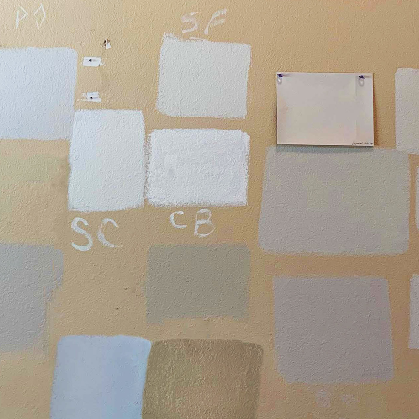
5. Paint some color samples right on your wall.

Please don’t do this!! Here’s why:
- It’s too hard to compare among different options. Your colors are stuck where you painted them, so you can’t see how the third-from-the-left compares to the one on the far right, in order to decide between them.
- To get a good “read”, you’d need to prime your existing wall (unless it’s already a white) and then roll on at least two solid coats of color. Most people rush the process, don’t prime, and brush on one quick coat, so they don’t get the paint color saturated enough to judge it properly.
- Your painted samples are framed and influenced by the color of the wall around it, especially if your current wall is a strong color.
- You can’t move the samples around to see how the colors look in various parts of your room, or against different existing finishes like the trim on your door frames or the tile of your kitchen backsplash.
As color consultants, we’ve walked into many sad scenes like this one. Why on earth would anyone think this was the best way to choose paint colors? The poor homeowner probably spent more time, money, and aggravation in painting all those sample squares than if they had just hired an interior designer for an in-home consultation in the first place.
How do you test colors, when you’re trying to pick the right paint color?

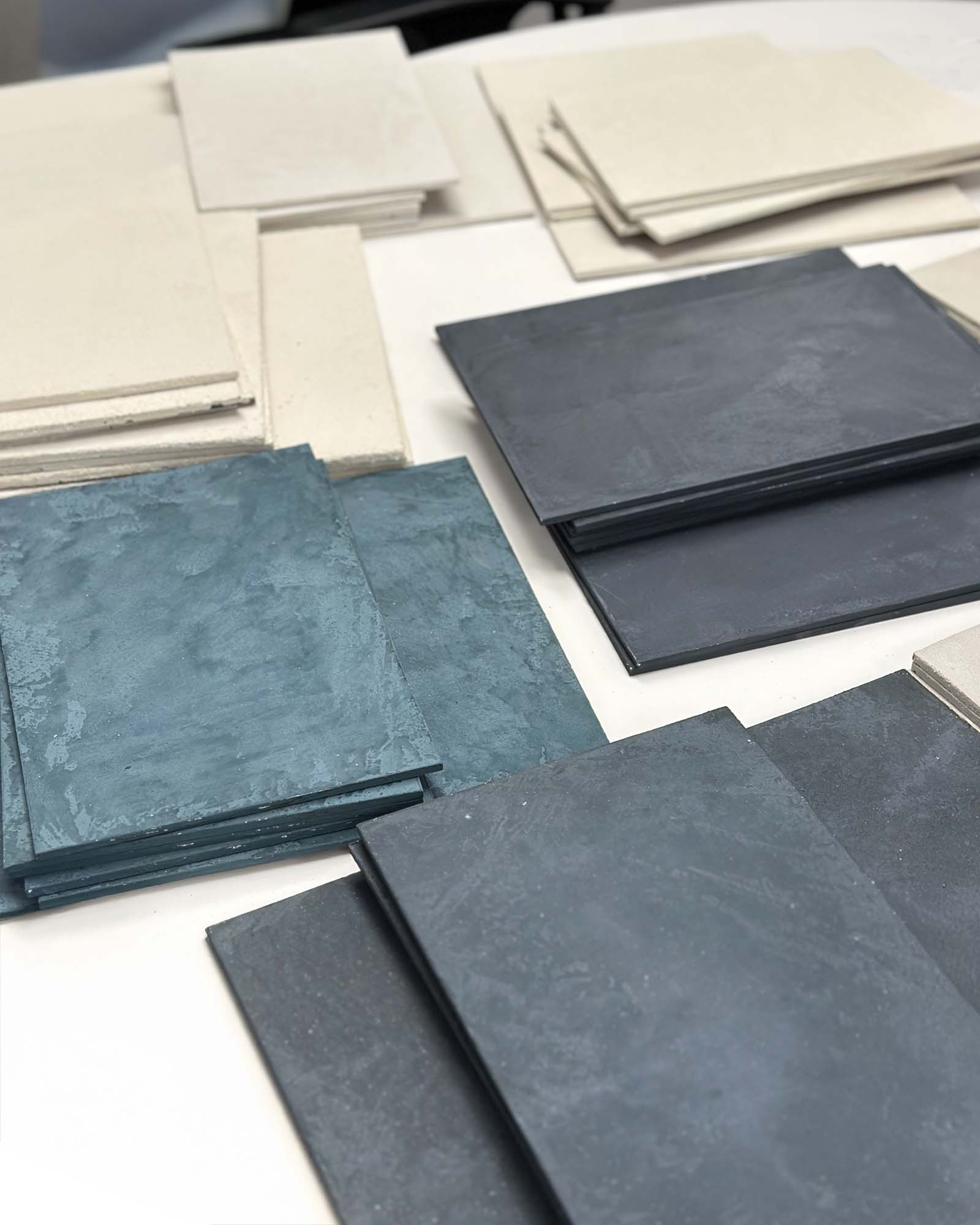
Paint them onto poster boards, so you can carry them around, compare them side-by-side, and evaluate them properly. (We explain how to sample colors here.) Or, save yourself some time and get some pre-painted peel-and-stick samples delivered by Samplize. Hint: you can start with those tiny color chips, but then narrow them down to a handful of “finalists” and make large-sized color boards of those, or order some painted samples, to judge by.
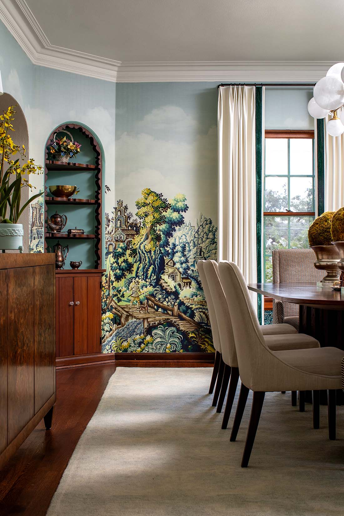
And if you really want to paint some samples on the wall directly? At least do it properly, the way the Baxter Design Group hired us to put up some large-scale samples for this San Antonio project.

And remember, hiring an interior designer or color consultant to help you is always a good idea. The right professional can save your project from a mediocre, or even disastrous, outcome. Picking paint color can be tricky, so take your time, get the largest sample sizes you can, and evaluate your choices in context, within the entire space.