Try googling “upcoming color trends in interior design” and you’ll get see a plethora of posts listing the “10 (or 15, or 21) most popular paint colors to use right now!”, or “The 2022 color of the month/year”, etc.
This post is NOT about that.
Since I’m one of the color consultants for Paper Moon Painting, I get asked all the time what the next color trends will be. Nobody wants to pick a paint color that is clearly passé, or that will be in a couple years. So let me put your mind at ease:
Upcoming color trends are more about personality and individuality
Meaning, less blind adherence to a trend, and more uniqueness and experimentation.
Past color trends revolved around the “neutral color of the decade”, plus a few accent colors that paired well with that neutral. They could be somewhat formulaic, as we all adhered to the same color schemes.
I still shudder when I think of the “Tuscan” trend of all browns that plagued us during the 90’s and early 2000’s. Like those schools of fish that all move as one, we all used tans and browns as our base neutral (walls, floors, ceilings, furniture), and added a few safe accents like golds or rusty reds.

Then in one swift move, we all switched to the palate-cleansing “light and bright” trend. (I personally love this one.) Everything tan got painted white. For those who still loved their earth tones, “modern farmhouse” evolved as a gentler transition, by using stained woods and keeping warm, soothing colors like sage green. But overall, the lighter, the better. This guest bedroom we painted for Slaughter Design Studio is an example of how, when done well, this look is fresh and timeless.

Then the gray trend came. Being a (mostly) coolor tone, gray was still a reaction against all those heavy earth tones from the 90’s. And an overall gray color scheme was easy to achieve for most people, especially households with young kids. Gray walls, gray sofas, gray area rugs… It was easy to shop for and easy to pull together, using lighter and darker tones of gray to add interest. This is the closest we’ve come to a monochromatic color scheme that we all remember from art class.

But now we’re running out of neutrals! We’ve gone from brown to white to gray…
In terms of upcoming color trends, what’s the next big neutral going to be?
The short answer: light, fresh color on walls (still lots of whites, off-whites, grays and even beige), but an eclectic mix everywhere else.

Here’s where your personality comes in, whether it’s boho as above, or “grand millennial” (updated traditional) like below. As people have gotten just a tad bored with monochromatic color trends like white or gray, they’re bringing in pops of color and strong contrasts. (This is why so many articles on upcoming color trends mentioned black for the past few years, as well as vibrant blues, greens and jewel tones.) This is the trend we’re in currently, and I think it’s going to continue for several more years. Light colors are still the fresh backdrop we need to make our accent colors sing. (Art galleries have the right idea!)

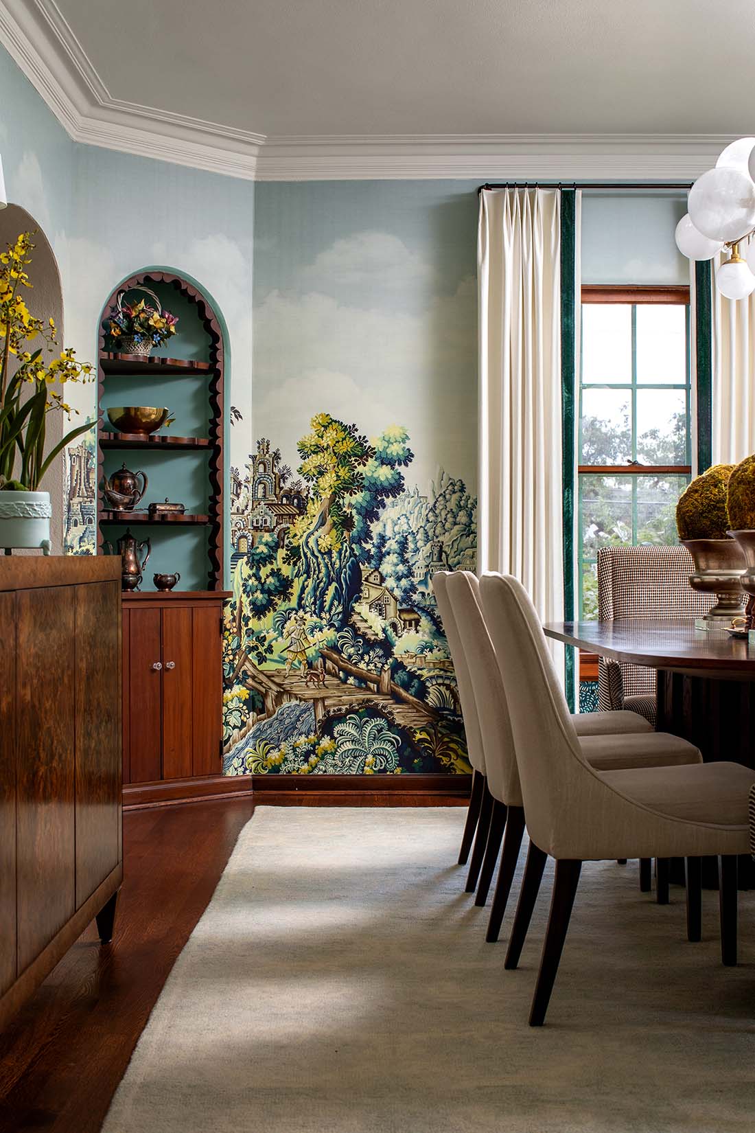
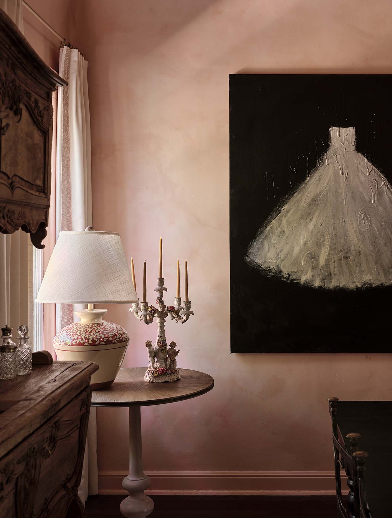
Rich, strong color almost always works

In this gorgeous living room, the color comes in the form of this rich blue grasscloth. And below, this lovely, muted blue/green gives this guest room character.

At our core right, I think a lot of our choices right now, even in color trends, are driven by a desire for uniqueness, individuality, personality.
Us being stuck in our homes for a year reminded us that our spaces matter, and that they should reflect us. Maybe we started to feel a bit freer to experiment, to try that bold graphic peel-and-stick wallpaper or paint that dusty pink accent wall. And as sites like Instagram and Pinterest democratized interior design and we all saw homes like ours being done in strong colors, soft pale tones, and everything in between, inspiration exploded.


The one upcoming color trend I can safely still bet on? Not brown.
There are some exceptions, but for the most part, we’re just not going back to the heavy, all brown “Tuscan” phase (thank god). I’ve seen a few designers successfully envelope a space in warm beiges and browns, but the use of pattern and variety in those spaces mean they feel cozy, but not dark or oppressive. I wouldn’t recommend anyone paint their walls tan or brown unless they layer in lots of patterns and use lights and darks to break up the heaviness that brown naturally brings to any space. Baxter Design Group used warm tones masterfully in this kitchen in the Texas Hill Country. Note that the walls are actually an off-white (in a tinted finish plaster that we applied throughout this gorgeous home).

My personal take? As long as you adhere to basic interior design principles (like making sure the undertones in your space don’t clash), pick either a light, pleasing base color for your walls, OR a deep, strong tone (navy blue, deep dark green, even black). Then mix in any fresh or bright colors that appeal to you! Go for the fun, eclectic mix. (Just don’t pick eight accent colors! Two or three will do.) Make sure your accessories are the right scale – a classic rookie mistake is to use lamps, artwork, and even rugs that are too small for the space, which makes your home feel cluttered. Boldness is in right now! Posts on upcoming color trends for 2022 will suggest everything from green to gold to amethyst, but my advice is to worry less about specific colors and more about creating a personalized, refreshing mix!