Whether you want a “bright white” kitchen or you love some of the softer, warmer whites that are trending now, selecting the right white kitchen paint color for your walls or cabinets can be massively frustrating!
After all, there are hundreds of whites, off-whites, and beiges out there, in all variations of undertones: blue-whites, yellow-whites, pink-whites. Navigating undertones is tricky, but if just need a little guidance to make the choice on your own, let’s look at a few ways to help you pick the best white for your kitchen.
Toss out any pre-conceived ideas about the “right white”

Some classic whites show up so often on Instagram or Pinterest that you may already have some colors in mind. Or you try googling “white kitchen paint color” and see dozens of blogs with white paint recommendations. So you think you know what you want already.
While I understand the desire to research ahead of time, it’s almost better to start from scratch. Often we show up at a color consultation and the homeowner already has several bright, fresh white paint chips taped to the cabinets in question. Rather than having pre-selected whites to look at, show us your inspiration photos. While I understand the helpfulness, we humans can become very easily invested in our decisions, even early-stage ones, and this can keep us from seeing better options!
But what if you saw the “perfect” kitchen online and you’d like to use the white paint color they referenced?
Remember that most online photos are edited or filtered
We see this so much that we wrote a whole article about it.
Editing a photo isn’t done to mislead, but to make sure the image reflects reality (or an ideal version of it), and to be beautiful as well. Professional photos are edited to look good, not to serve as a color reference.

Photos of specific paint colors from the manufacturers’ own websites aren’t much better. To illustrate the point, farther down in this post, we’ve taken screenshots of paint colors we’ve used in actual Paper Moon projects, and put them next to the photo of the kitchen itself. They almost never look the same.
What does this mean for you?
Simply seeing which white paint color was referenced in a post or photo will not give you an accurate idea of what that color would look like in YOUR home, under your lighting conditions, with your own finishes and furnishings in the room.
To pick a white kitchen paint color that works, take your fixed elements into account


This is one of those hard truths that your designer or color consultant wants you to know. Your kitchen’s “fixed elements” are its countertops, backsplash, and flooring. So unless you’re doing a full kitchen renovation, you’re not starting with a clean slate. Some of the colors already in your kitchen are going to stay, and they matter.
The single biggest reason most homeowners end up with a different white kitchen paint color than they first envisioned? The countertops and backsplash.
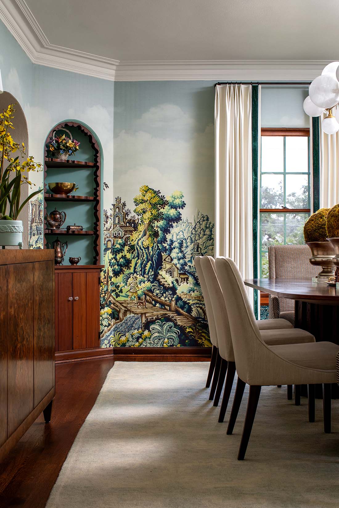
If you already have elements in your kitchen that work with a variety of whites, like certain kinds of marble or black stone countertops, this part is easy. This kitchen’s cabinets were painted in Sherwin Williams “Greek Villa”, which is not as bright a white as you might think, but works beautifully:


But if your home has warmer finishes, you’ll have to adjust your expectations.
You may have fallen in love with a photo showing bright white cabinets painted in Sherwin Williams’ “Extra White”, but that kitchen also has white subway tile and gray quartz countertops.


Will “Extra White” work in your own kitchen, with its granite counters and pink-beige travertine backsplash? Definitely not! Against the warm tones of your fixed elements, your freshly-painted cabinets would look bluish-white, as stark as a piece of paper, and the clash of undertones wouldn’t look pleasing to the eye.
In your kitchen, you’d need a much softer, toned-down white with just enough warmth in it to “play well” with your counters and backsplash.

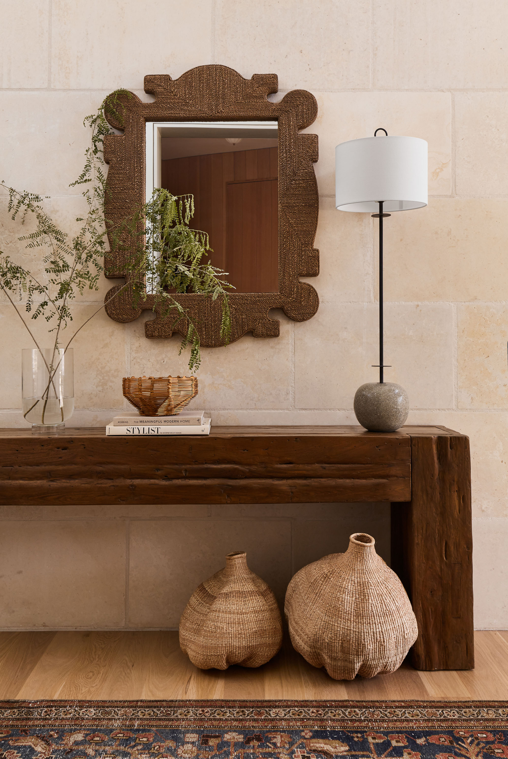
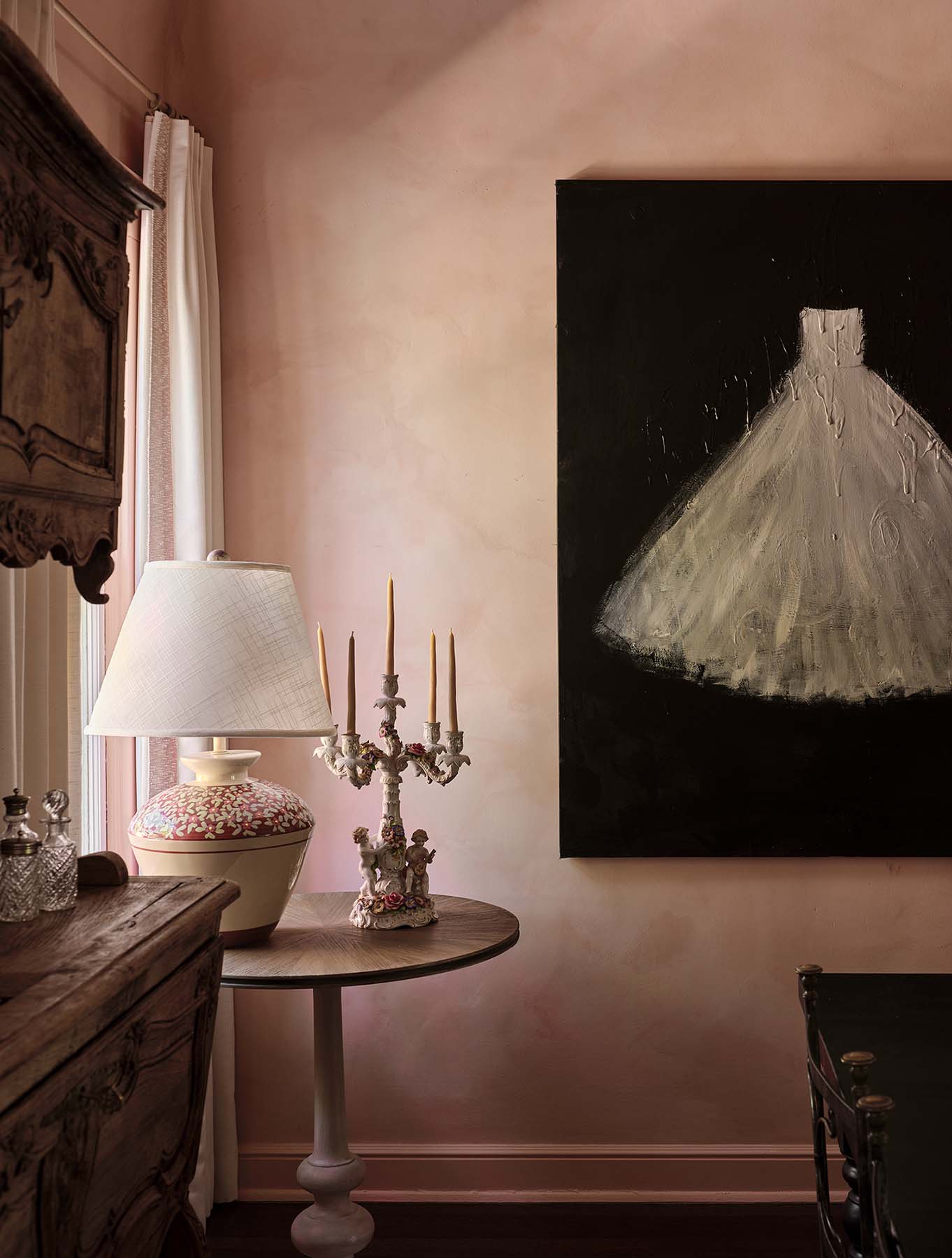
If you have a lot of pink-beige marble or travertine similar to the lovely bathroom photo above, you might try painting your cabinets either Benjamin Moore’s “Ballet White” or “Swiss Coffee“. They’re not bright whites, but they’ll look fresh and lovely against the natural stone.
Follow these steps when making your decision
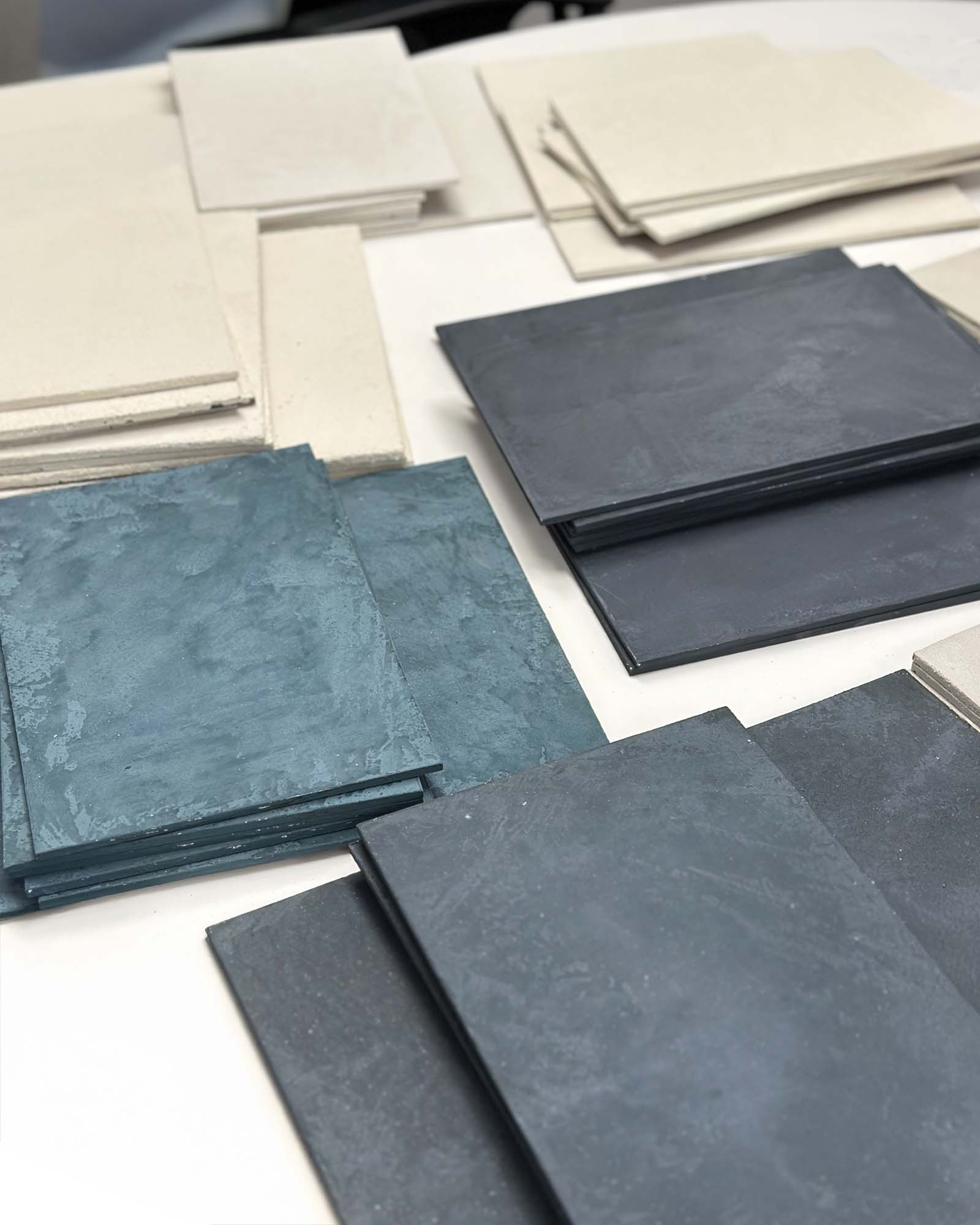
- Get a bunch of white sample chips from the paint store, in a variety of undertones. Make sure you take home some whites that you don’t think you’d consider because they might seem too creamy or too pink or not bright enough.
- At home, hold these color chips up to your countertops and backsplash. When we do this as part of a color consultation, we use large-sized color sample boards, but you can start with small chips for now. Eliminate color chips that clash until you’ve ended up with three or four “finalists”. You’re looking for colors that coordinate well with your backsplash, counters, and wall color (unless you’ll be painting the walls too). If any of your white chips stand out as too glaring, too gray or too blue, eliminate them.
- Now, you need large sample boards of those narrowed-down choices. You can make your own by getting some small samples pots of color from the paint store and painting them on poster board, cut down to about the size of a sheet of paper. Or just order some pre-made ones from Samplize, to save time.
- Hold your larger-sized color boards up to your counters and backsplash and make your final selection. If you are torn between two options that are very close to each other, don’t worry – odds are either one would work. Having larger samples to evaluate really makes it easier.
By following this process, it should become clear which is the best white for you. If you’ve been clear-eyed about narrowing down your choices, your “finalist” colors will already be good options because they will all coordinate well with your kitchen’s fixed elements. So now you’re just picking a winner from this select group. This comes down to your own personal preference, and you’re free to choose based on which appeals most to you.
Don’t be disappointed if the warmer white that actually works in your kitchen isn’t the bright white that you thought you wanted. Even with a warmer off-white, your kitchen won’t look creamy or yellow-y. Rather, you’ll have a fresh, updated white kitchen, where the tones and colors play well together and don’t fight each other. The result will look coordinated and well-designed.

Key takeaways on selecting the right white kitchen paint color
- Don’t start with any pre-conceived color selections that may keep you from seeing better options, especially if you fell in love with some kitchen photos you found online.
- Remember that almost all photos you find online have been edited or photoshopped! That color may not read the same in your kitchen.
- You need to evaluate the fixed elements in your own kitchen when choosing the right cabinet color.
- Hold several color chips up to your counters and backsplash, see which ones coordinate well and which ones don’t belong, and pick a few “finalists”. Then order or make some larger-sized samples of those colors, to help make your final decision.
Follow the steps above, and you’ll be able to pick the best white for your space without any problems. Whether you want a creamy white or a pinkish off-white or a neutral bright, the right white kitchen paint color is within your grasp!