Painting a room white can make it feel open, clean, spacious, welcoming, and calming, all at the same time. But there’s more to white paint than you think. Subtle variations in tone between white paints can have a vastly different effect on your space, but because white seems “mistake-proof”, most homeowners don’t evaluate the choice of white thoroughly enough.
Choose Your White Paint Color Carefully

You might think choosing white for your interior couldn’t be easier, but finding the right tone is not as simple as just picking the brightest, prettiest white in the paint store’s color chip aisle. So first, some basic principles, which you probably already know but bear repeating.
White and other light neutrals have different undertones.
Whites with pink or yellow undertones will look warmer than those with blue or green undertones (just think of the difference between the “warm” tone of the ivory keys on a piano, and the “cool” tone of a piece of paper). If you don’t evaluate your color choices based on undertone, your “white” living room could look like it was painted “butter yellow”, or your master bedroom could look “concrete gray”.
Color is influenced by architecture, natural light, and your home’s orientation.
This is one of the 6 hard truths that we wrote about. Does the main living space in your home face south or west? Then it’s likely to look warmer, especially if it has lots of windows (and probably feel physically warmer as well – but that’s a different subject!). With all that south- or west-facing natural light, you can use a cooler shade of white to balance the room. On the flip side, spaces that face north look “cooler”, so you’ll need a warmer white to keep the room from looking downright cold or even depressing.
The same is true for rooms where the light fixtures have a color temperature that is too cool. “Daylight white” is actually a misnomer, since it’s way too cold and blue for indoor lighting. Make sure your light bulbs or LEDs and your paint color work well together.

In rooms with abundant natural light, white paint can appear different throughout the day, and can even be affected by how much greenery is outside your windows. Be sure to try a sample of any color you’re considering to see how it looks in the morning, afternoon, and at night. It’s best to paint samples on poster boards so you can also evaluate them on various walls in the room. But don’t worry if your favorite white sample doesn’t look perfect on every wall, at every time of day… no color will look perfect everywhere, all the time! You just want the color that looks best overall, most of the time.
[Related: It’s an older post, but color consultant Maria Killam has an excellent article about how the greenery outside your windows can affect your white paint color here.]
Remember, you must evaluate your white paint colors in your own space, not at the paint store! And select from a variety of whites with various undertones, so you can be sure you made the right choice.
White Paint is the perfect “blank canvas”
It takes some design skill to keep an all-white space from looking cold or uncomfortable, especially if the space has lots of hard materials such as metal and natural stone. You want your home to feel welcoming rather than too antiseptic or empty.
How do you keep an all-white space interesting?
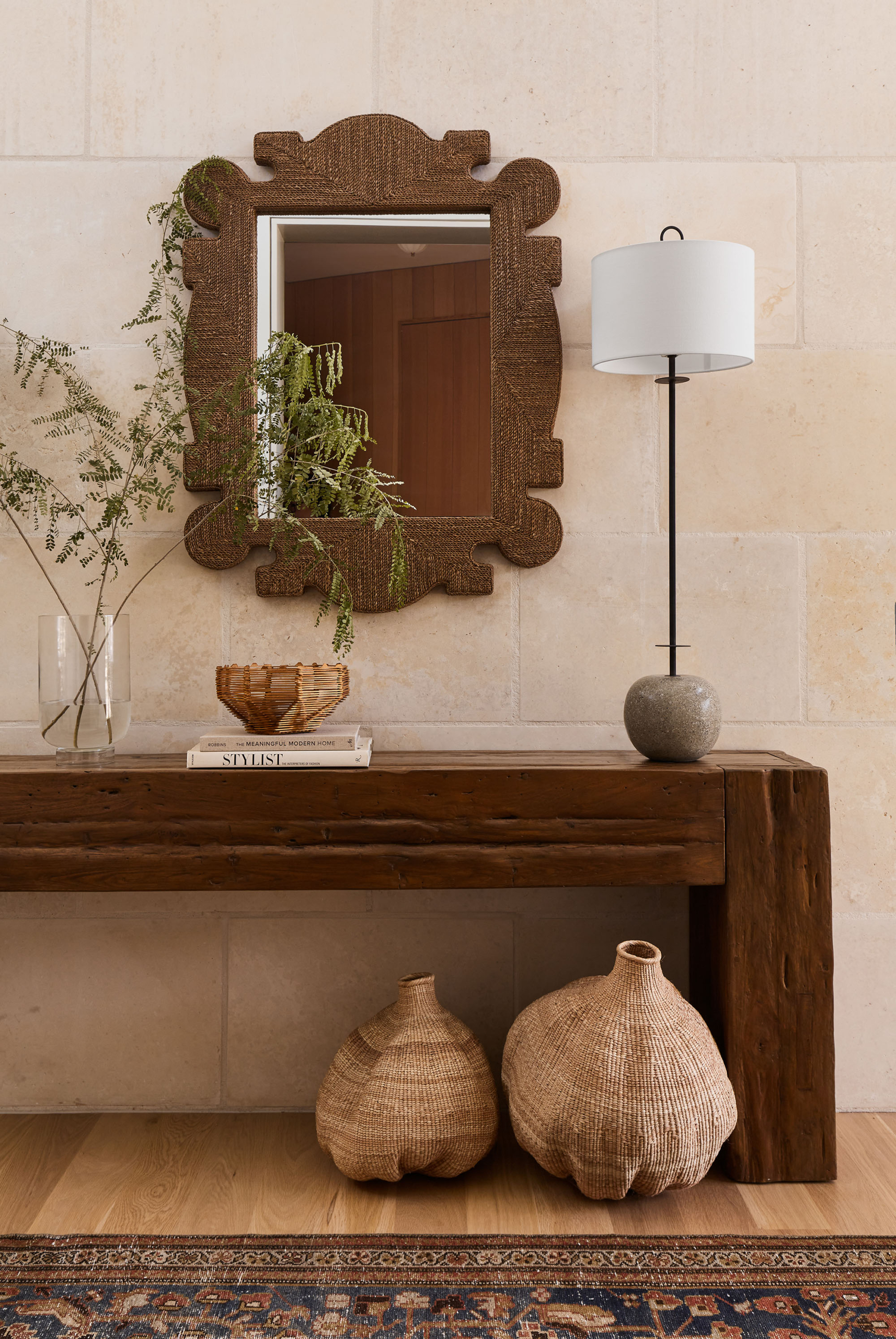
Textures

A well-designed room should have a pleasing combination of textures and materials. An area rug covers a fair amount of visual ground and will add interest. And you’ll have fabrics in your space, so that’s an easy way to add luscious textures: linen drapes, silk pillows, a chenille sofa or woven throw.
Contrast
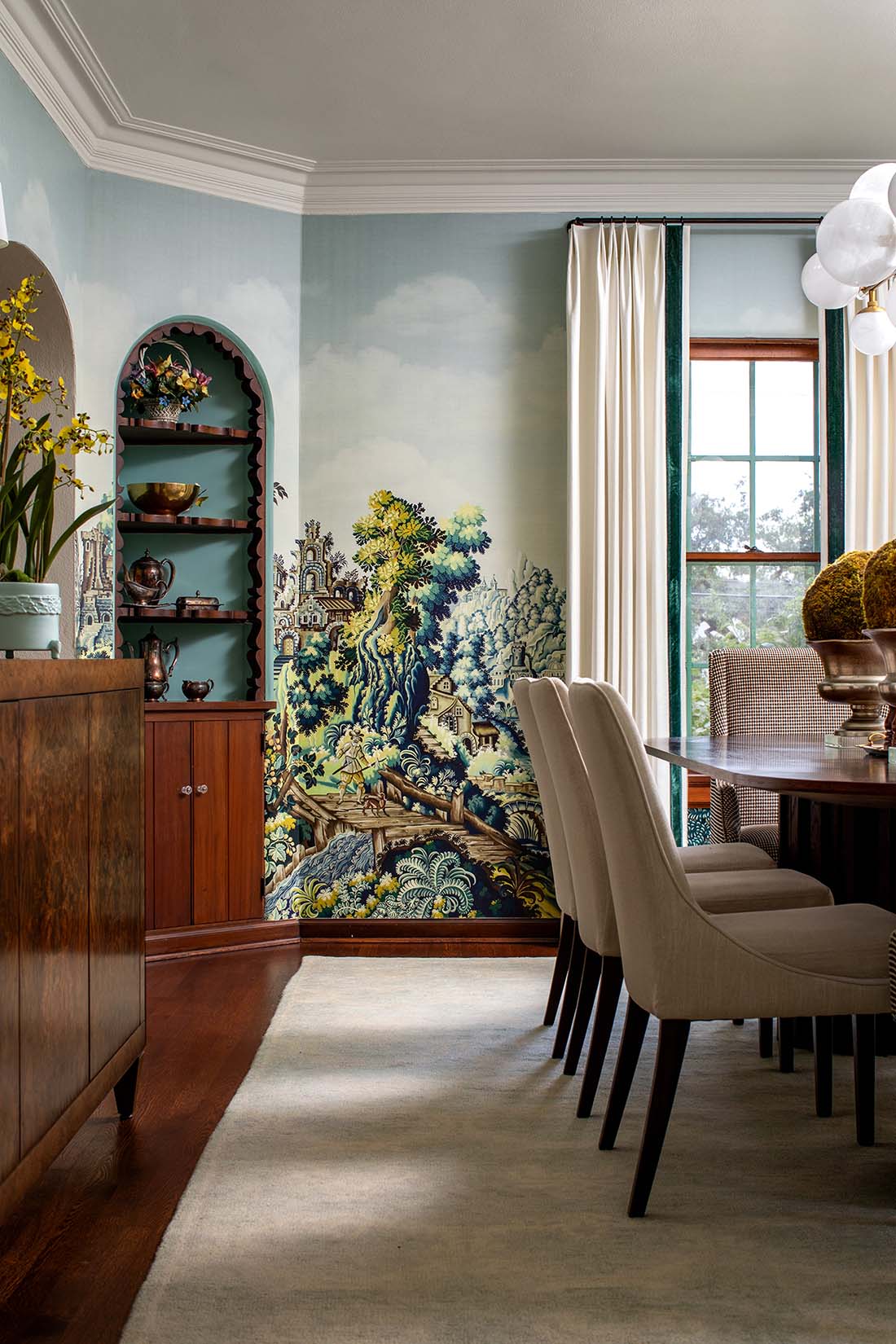
Just in the past few years, we’ve seen the evolution of kitchens from tans and browns (during the “Tuscan” trend) to all white (especially in the “modern farmhouse” look), and now, we’re seeing something new in those white kitchens: contrast. Technically, once you introduce contrast your space is no longer “all white”, but a little contrast goes a long way! In a kitchen, consider painting part of the cabinets (the lowers, or the island, or the cabinets flanking the range) in a different color. In a living room, the area rug or the sofa are perfect opportunities to inject a little contrast, color, or pattern.

Think of an all-white living room with a white area rug, and rich green chairs. Or that same room with a white sofa on top of a vibrant kilim- or oushak-inspired patterned rug with lots of reds or pinks in it. Or a white room, hardwood floors, white rug, white sofa… and two chairs in a blue-and-white pattern, with drapes made of that same blue-and-white fabric… and maybe a brass-edged glass coffee table. the possibilities are endless.
Artwork

We realize art is very personal, but there are still a few considerations when choosing works for white spaces (or any space, for that matter).
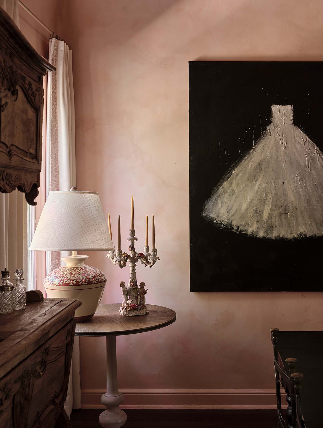
If you have a busy room, one piece of oversized artwork could be a perfect choice.
However, in rooms that are either lacking in interesting architectural features or have an overpowering feature (such as dark red brick), a gallery wall can work wonders to create a focal point and add some visual interest.
Either one large piece of art or a well-curated gallery wall can really make a white space sing. The mistake to avoid? One or two small pieces. Either go big, or go with plenty of works of art grouped together.
Bonus tips for using white paint in interior design
• Paint your doors, baseboards and window frames in the same white that you painted your walls. In this way, you create a sense of harmony and unity. Most often, your walls will be in a flatter sheen and your woodwork will be slightly glossier, which creates a subtle variety.
• Want to use several shades of white in one space? It’s doable! But make sure that your whites all belong to the same group of undertones: warm or cool.
• Cool whites work very well in rooms that need a clean feel, such as bathrooms or kitchens. Plus those areas are usually well lit, which keeps a cool white space looking fresh. And it’s easy to find some great stone or tile options in cool whites!
• If you want a beautiful white painted room full of dynamism, combine white with bright colors such as strong blues or greens (always classic) or bold reds or pinks. Just note that this can take some skill to pull off! And for white kitchens, this step-by-step post on how to pick the right white kitchen paint color explains more about how to test your color samples and pick the right white.

White is an incredibly versatile and accommodating color, but picking the perfect mix of white is not as straightforward as many homeowners imagine. Color is tricky, and mistakes are expensive. Make sure you’ve got the right mix of textures, contrast, and artistic touches when you’re using white paint in interior design.