How do I make my accent wall look good?
Whether painted or wallpapered or done in a special materials like rustic wood, we’ve all seen the good, the bad, and the ugly when it comes to focal walls or feature walls. Usually we see a cute little corner in our house or an area that looks like it “should” be important, so we think it’ll make a great accent wall. But there are some very simple do’s and don’ts to keep in mind before you start looking for accent wall ideas!

Accent walls can trend “in” or “out”, but what’s more important than whether they’re currently in vogue, or whether you paint them or do something else, is whether or not you’ve picked the right wall to accent in the first place!
First, the most important thing to understand about accent walls is that they provide contrast. This is their main design contribution – even more than color or texture.

Therefore, the “outline” of that contrasting area is the main factor in the success (or failure) of your accent wall. The shape of the space is what you have to evaluate, more than anything else. There are thousands of accent wall ideas out there, but evaluate any potential feature wall in terms of its simplicity of shape, first and foremost.
Why is this??
We know that color choice is important, but the human eye will see contrast first.
Most of the time, an accent wall will “read” as either darker or busier than the surrounding area. Since it’s essentially a large contrasting surface, the shape of your feature wall needs to be clean-lined and simple, so that your brain doesn’t waste energy trying to interpret the hodgepodge of contrast on your wall, and can just appreciate that within this simple rectangle, there’s some very nice color or pattern or texture. If that shape or contour isn’t pleasing, from a design perspective, your accent wall will make your space look busy or disjointed.


The most important thing to understand about accent walls is that they provide contrast. This is their main design contribution – even more than color or texture.
We’ll look at five design “do’s”, and two design “don’ts”, when it comes to picking the right space to feature. Let’s start with the positives.
Accent wall “Do’s”
Here are five ideal scenarios where an accent wall should work well.
A wall that is a largely uninterrupted rectangle
This is the ideal scenario that calls for a feature wall. But aren’t almost all walls already rectangles?
What we mean is a wall where there is minimal interference from doors or windows. Classic examples are the headboard wall in a bedroom, or the TV wall in your living room.

This means that a wall underneath a vaulted or cathedral ceiling, where the ceiling line angles upward, is not necessarily the best candidate. Rather than your eye happily settling on the pretty rectangle of colorful space that is your accent wall, it’s trying to make sense of why this angled area is different from its surroundings. It can be done, but it’s tricky to pull off. Rectangular walls are a safer choice.

And a wall with lots of interruptions in the form of doors or windows could be problematic. If there are windows in your feature wall, they should be symmetrically spaced, which helps to balance the visuals of the space.
Why are doors and windows a factor?
Windows will be perceived as high-contrast pockets of light against your dark(er) accent wall. Remember how your eye reads shapes of contrast first, before color? The bright spots in your wall, where the windows are, will significantly interrupt your color or wallpaper or featured material.

If you have a row of three windows in the center of your wall, or one narrow window at each end, the symmetry is easy on the brain . . . you can ignore the clean, simple layout of the wall and focus on the beautiful color or pattern. However, if you have a door at one end of the wall and a large window at the other, your accent wall will feel like it has random shapes cut out of it, and that won’t be as pleasing to the eye.
A wall with strict symmetry

Not every candidate for an accent wall will be one solid, uninterrupted rectangle. If your prospective wall has doors or windows, just make sure they’re balanced and symmetrical within your wall. Remember, you’re already feeding your brain a contrasting color or pattern when you look at your feature wall, so don’t make your brain deal with asymmetry as well.
And remember how we said a rectangular wall is better than a wall with angles? There are exceptions, of course. The key is usually symmetry, and ensuring that the overall effect isn’t too busy.

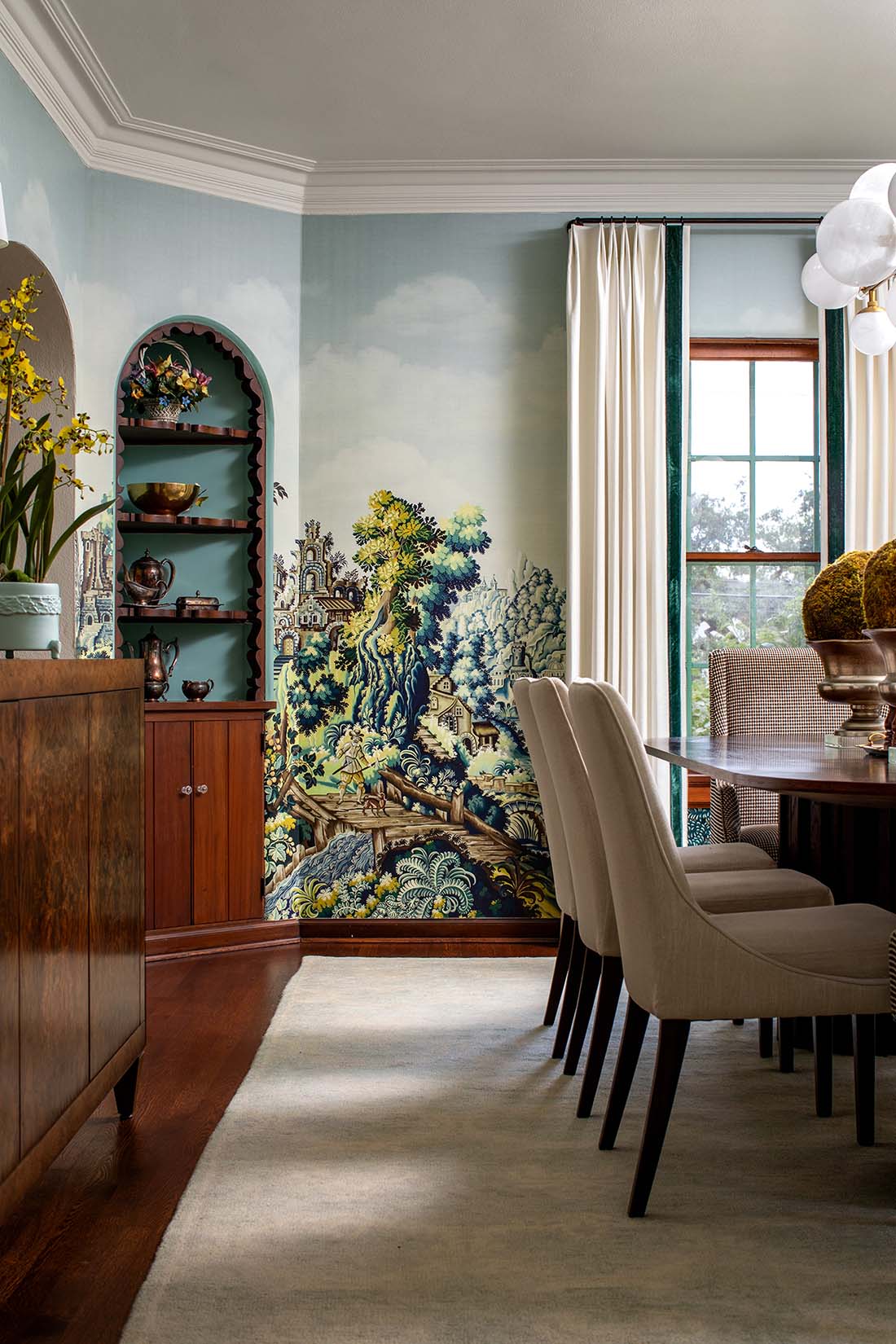
An inset area that can carry a strong contrast without feeling fussy or out-of-place
Classic example: a breakfast area, reading nook, or a large window seat niche. Or you could insert an accent color or material beside a fireplace. Just make sure the rectangular area flanking your fireplace is substantial enough, or your wall will look chopped up visually.

No matter where it is, make sure your accent area isn’t so small that it looks out-of-place or confusing to the eye! It should carry enough visual weight in your space to make sense.


On the ceiling
We love the impact of a wallpapered ceiling! A classic example is a powder bath ceiling painted in a strong color. However, if the space can handle it, accenting a large ceiling can look amazing.


A wallpapered ceiling doesn’t necessarily have to be bold or eye-catching. A subtle texture can envelop your space in a sense of quiet sophistication.

The backs of bookshelves
Technically, this is more of a wall section than an accent wall, but the back wall of built-in bookshelves forms a nice large rectangle of space that could look great with a contrasting color or texture.


What about scenarios where an accent wall is NOT a good idea?
Our accent wall “Don’ts”:
Although there are always exceptions, here are two scenarios where an accent wall can make a space feel disjointed, rather than enhanced or elevated.
Avoid kitchens or primary baths
Kitchens and master baths are too full of large “interruptions” on the walls: cabinets, bathroom mirrors, shower enclosures, appliances, pantry doors. By the time you paint your kitchen or bath walls a contrasting color, your eye just sees horizontal and vertical strips of light and dark, like a giant Tetris screen.
Remember, an accent wall is basically a large block of contrast within whatever surrounds it.
Therefore it should be a pleasing overall shape that makes sense in your space. Try to avoid a hodgepodge effect of dark contrasting color that surrounds your cabinets, mirrors or doors in a series of helter-skelter strips.
.
Don’t do niches, unless they’re very large
Painting niches an accent color was a big thing in the 90’s, when builders tucked the darned things into every wall they could, just to show off. This was especially common in transition areas like hallways and vestibules. Unfortunately, most niches are fairly small (say, 3 x 5 feet). If you paint them a dark color, the contrast in the middle of the wall just looks choppy.
In my perfect world, all those niches would be sheetrocked over, so that you have a nice plain wall to work with. That way you aren’t limited in the size of artwork or furnishings you can use. But if you’re stuck with your niches, at least don’t paint them. Let whatever artwork or piece of sculpture you put in there take center stage.
The exception to this would be niches that are so large, they go down to the floor and occupy a significant portion of the wall. Even then, the effect can look contrived, as if you knew you had a niche and felt you just had to do something with it. If your niche is really more of a large inset section of your wall, then that’s okay. Niches that are designed to hold a bed are a good example where this works.


Should I paint or wallpaper my accent wall?
Accent walls are so flexible. It doesn’t matter if you paint them, wallpaper them, or clad them in wood or leather or any other material. Most often, they’ll be wallpapered, but that’s not a hard-and-fast rule. Assuming you’ve picked the right wall in the first place, then all that really matters is that it’s different. Different color, different pattern, different texture . . . as long as it contrasts nicely with its surroundings, your accent wall will look good!

That being said, most painted accent walls have some trim work done in addition to paint, like a slat wall or a board and batten design, to give it a bit more sophistication and distinction. Even in kids’ rooms, where the low cost and effort of just painting an accent wall makes the most sense, you’ll often see some millwork applied as well.

Can you just paint a feature wall without it looking cheesy? Yes, as long as the decor in that room is strong enough to carry the space!

Is an accent wall a good idea? Aren’t accent walls outdated?
You can find articles that argue the point on both sides. This is like asking if subway tile is outdated. It all depends on your particular space. Pick the right wall and apply a pleasing treatment (the right paint color, wallpaper, or other materials), and it won’t matter what anyone else is doing. Make the overall design work for you.
What if I change my mind?
That’s the beauty of accent walls – because they’re usually in a self-contained space (rather than all over your entire room), they’re easy to change! This is where you can try that peel-and-stick wallpaper for your daughter’s room, or have a little fun with the bookshelves in your home office. You can always paint them out later!

Here’s a quick summary of our advice about how to pull off a good feature wall:
TL;DR Summary – 7 Do’s and Don’ts of Accent Walls
- Pick a wall that is a simple rectangle.
- Use a wall with symmetry, especially if it has doors or windows in it.
- Try a good-sized inset area to feature.
- A ceiling can make a great accent wall.
- Accent the back of your inset bookshelves.
- Don’t do kitchens or master baths unless they have a plain, uninterrupted wall.
- Don’t do niches, unless they’re large enough to count as an inset accent wall.
And if you take away just one point . . . pick the right wall to use as your accent wall, and the rest should fall into place. A lovely accent wall, done right, can make your space look sophisticated and well-designed, and is a nice unexpected touch in any home.