Picking exterior paint colors is the scariest part of their project for most homeowners.
The process seems fraught with peril. What if your house ends up looking garish and (even worse) everybody sees? What if it goes from “old, outdated eyesore” to “expensively painted eyesore”, and now you’ve spent your whole budget and it’s too late to change anything? Painting your home exterior is about the most public design decision you can make. What if that happy yellow color that you thought would be so cheerful and unique now just looks neon-bright and angers your neighbors? You want your home to look beautiful, after all.
If the thought of choosing exterior paint colors makes you want to clean out your gutters or tackle your taxes instead, you’re not alone. There are unique challenges to choosing the right exterior paint colors. The surface area (the whole outside of your house) is huge, which makes it really hard to visualize the result from just those tiny paint chips or “exterior color palette” brochures. You’ll be spending a pretty penny to get this done. Success or failure hinges on the right choice of color. And how can you evaluate and choose color properly when paint colors look so different when they’re outside in direct sunlight??
Thankfully, there are some key principles that can help you make that choice with much more confidence!
Do you need a color consultant to help pick your exterior paint color?
First, let’s make the case for hiring a professional color consultant to help you out.
Color consultants might come to mind if you’re thinking about the inside of your home, how you want the paint colors to flow and make your home look like it was well designed. But they’re invaluable for picking exterior paint colors too.
We painted this lovely little historic home in San Antonio for Kim Wolfe’s HGTV show “Why the Heck Did I Buy this House?”, and the transformation she wrought inside and out was incredible – you can read all about it here.
Yet even the ultra-talented Kim hired color consultant Jim Smith to help make the right colors choices on this exterior. We include a free professional color consultation on every exterior painting project we do, because we feel this choice is so important to get right. Even if you’re thinking of hiring a color consultant on your own, our advice will always be Yes, do it, you’ll be glad you did.
But if you want to give it a try on your own, or even just want a little more insight into what makes an exterior paint color “work”, read on!
4 key guidelines for picking exterior paint colors
Let’s start with something you may not have given a second thought to: those small exterior sections done as an “accent”, like the stone around your front door or even on entire walls.
By the way, we’ll be talking about the main color, also called “body color” or “field color”, on your house exterior. This is the color of your stucco or wood siding. A whole exterior color palette will also include a color for your wood trim (fascia, soffits, doors and windows), and maybe a front door accent color. But by far the hardest part is selecting the main color! Once that decision is made, the rest is easy.
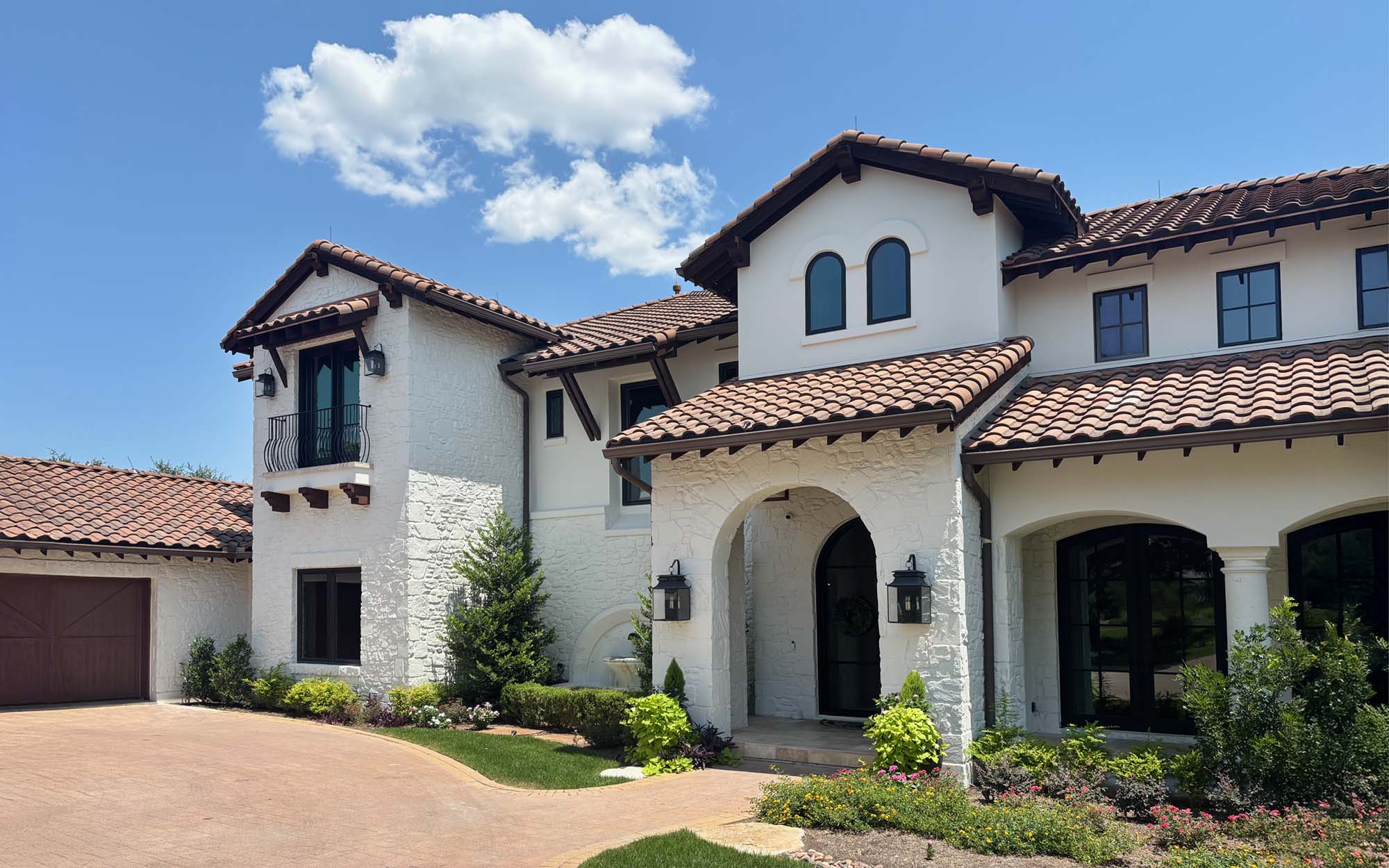
Incorporating stone or brick accent areas
Here’s the reality – if your home has existing stone or brick areas that won’t be painted, your stone or brick has more of a say in your home’s exterior colors than you do.
Like it or not, this is true. Unless your house has only wood clapboard siding (or synthetic equivalent), painted wood trim, and no other materials, your options are limited by whatever unpainted, natural materials were used on your home’s façade.
.
Many homes have entire sides of their home faced in brick or stone, or perhaps the lower half, or maybe just some entry columns wrapped in the local natural material. If your house is more contemporary, it may have large areas of unpainted concrete, or even steel. The key is, what areas of your home’s exterior will NOT get painted? Any paint color you select must “play well” with these materials.
.
Note – This is similar to picking the right kitchen cabinet paint color. Unless you’re doing a full remodel, you need to take your kitchen’s existing materials such as stone countertops or backsplash tile into account.
.
Therefore the first step in choosing exterior paint colors is to take these non-painted surfaces into account, no matter how little you pay attention to those areas ordinarily. You’ll do this by determining the “undertones” of those natural materials. Undertones can range from pink-beige to blue-gray to taupe. Whatever those undertones are, you need to know them so you can design your paint color to coordinate. Otherwise your newly-painted exterior will look like a poorly-designed hodgepodge of clashing colors. (Examples of this in real life are, sadly, easy to find.)
.
Identifying the undertones of your brick or stone
.
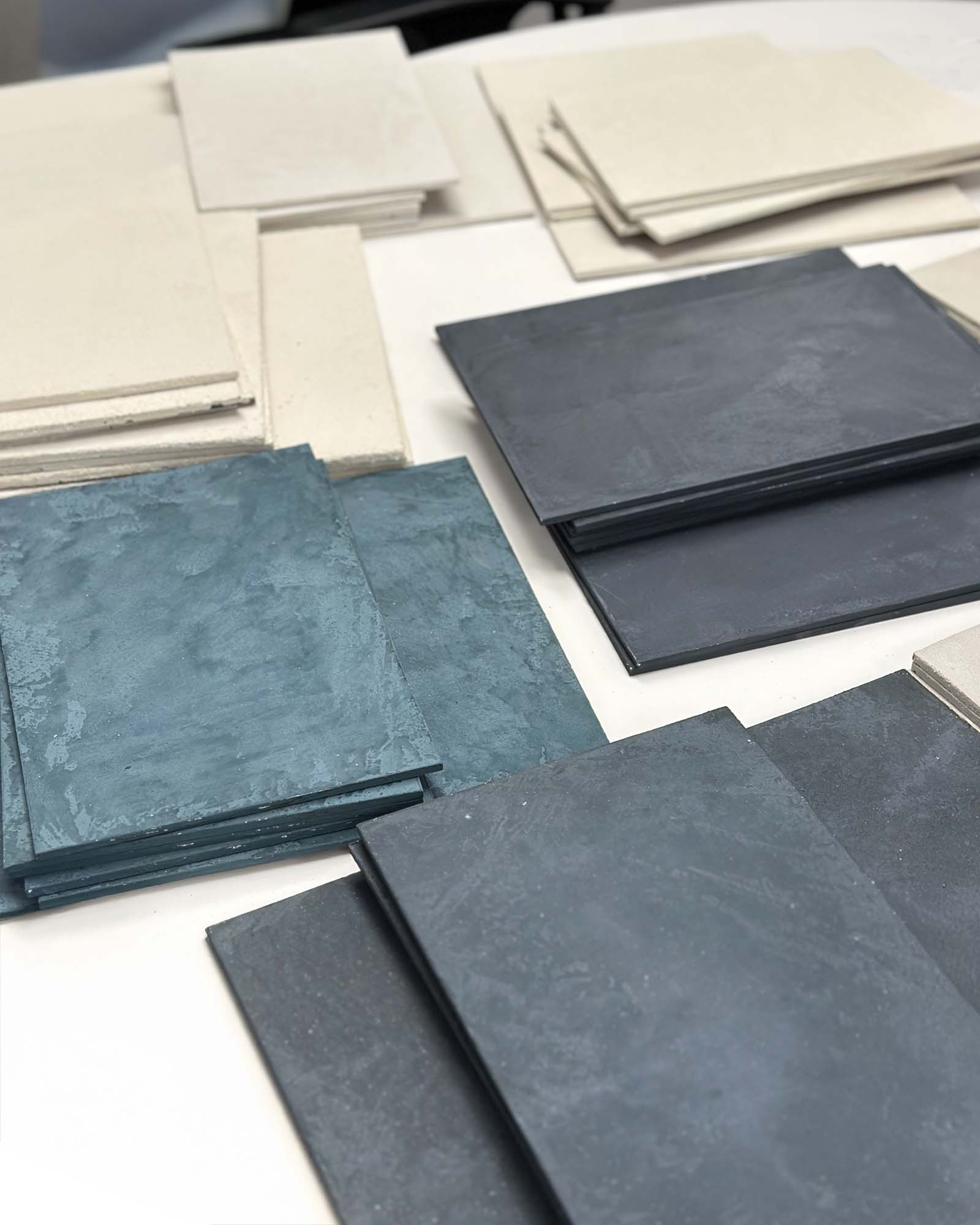
We go into this at length in our post on identifying undertones in exterior paint colors. If you’re ready to get your home painting started, read this post! But in a nutshell, your stone or brick will fall into one or more of the following neutral undertones.
.
Pink-beige
Orange-beige
Yellow-beige
Gold-beige
Green-beige
Green-gray
Blue-gray
Violet-gray
Taupe
.
You can see one or two of each of these undertones in the strip of color chips above. This is not an exact science! Many colors might seem to fall right in the middle. But you just need to come within the ballpark of the right undertone. Remember that colors are always viewed in context to what’s around them. Put two color chips next to each other, and one will look more “green” and one will look more “pink”, or “cooler” or “warmer”, or “bluer” or “yellower”. If you can pin down your brick or stone’s undertone with a decent degree of confidence, it’ll help you make an educated decision on your paint color.
.
By the way, this information on undertones is from nationally-known color consultant Maria Killam, who has written some fantastic blogs about picking the right exterior colors to go with your stone or brick. (Our Paper Moon Painting color consultants were trained by Maria Killam.) Here’s an oldie but goodie from her archives: Which siding color looks best with stone? Before and after
.
So the first thing to do is identify the undertone of any existing stone or brick, and pick an exterior paint color that will work with that. Don’t skip this step! Follow the guidance in our post on identifying undertones in exterior paint colors. Remember, the undertone of your fixed elements is the one thing you can’t change. Unless you’re doing more than just painting, such as replacing the stone or brick you have now, you must design your exterior color palette with this in mind. Take a look at this case study showing how to factor in the stone entry on a green-gray stucco exterior.
What about painting your stone or brick? Unless yours is a lime-washed cottage in Ireland, you’ll rarely see a fully painted stone house here. You can paint out small accent areas of stone so that they don’t limit your color choices, but I’d be careful about painting a whole house.
There are times when it works, however. This stunning home had huge areas in stone, which we painted right along with the stucco. Sometimes, the stone just has to go!
No such hesitation about brick, however. Brick exteriors are painted all the time, and have been for centuries. We’re huge fans of painted brick homes, having done a fair number of them ourselves. Here’s our post on whether you should paint your brick home.
.
Once you’ve narrowed down the undertone you’re working with, you can select some possible color options and test them. You don’t have to match your brick or stone’s color exactly (thank goodness), but your paint color must either share an undertone, or have an undertone that coordinates well with your brick or stone..
.
.
If you want a bright color, choose a muted version
..
Why? Because unless yours is a beach house, or one of San Francisco’s historic Victorian “painted ladies”, bright or saturated colors on an exterior can look artificial, unnatural, even tacky.
Once you know your stone’s undertone, you can decide on which neutral color will look good with it. It won’t be a strong color! A beach house in Florida can get away with turquoise blue or mint green (especially with lots of contrasting white trim), but otherwise, you’re probably not picking brights for your home’s exterior. Even if you love color, a neutral is your best choice, nine times out of ten. Save the accent color for your front door! Your neighbors will thank you..
.
This applies even in older neighborhoods with a “boho” or “modern retro” vibe, like some of the beloved quirky areas in Austin TX. A house might sport a bright green or orange front door, but the rest of the house will be an off-white, or neutral gray, or pale tan. A bold homeowner might paint their small bungalow an avocado green with a bright yellow front door, but that’s still a muted, more neutral version of green (as opposed to, say, an emerald green). Pick a muted color for your exterior!
Here’s an example I found online and Photoshopped, so you could see what I mean.
.
.This lovely home in Los Angeles is too “bubble gum pink”.
I love a pink home myself, but this is too cool and bright. It’s needs to be softer and warmer, like this, which is also much more authentic to the Spanish Mediterranean style of the home:
If that’s too “peachy” for the homeowners’ tastes, this is a good compromise:
Here’s the original again:
See what I mean? It’s a subtle difference, but it matters a great deal on a whole house façade. By the way, this home doesn’t have too many unpainted, natural materials, but it does have some: the classic red tile roof, and the terra cotta Saltillo tile on the front entry. Which of the three exterior color options goes best with these fixed elements? Only the second photo (the warmest option) is a true undertone match.
For a white or off-white home, don’t pick an actual bright white
A common mistake is to pick a color that is too light. Colors look MUCH brighter when seen outside. Hold a piece of paper outside in the bright sunlight and it’ll be almost blinding. You don’t want your house to look like a giant reflector.
A good rule of thumb is to pick a color that is two or three “steps” farther down, on a fan deck, from the top of the paint strip. The pretty white homes you see on Instagram or Pinterest are most likely painted in a beige, “greige” (grey-beige), or creamy color. Here are some examples from our own work.
This Austin, Texas beauty was painted in Benjamin Moore “Swiss Coffee“. And here’s its color chip:
.
Doesn’t look “white” on this chip, does it? This is why it’s so important to make sample boards of potential colors and evaluate them outside!
For cool colors, choose a warmer option
.
I love a classic gray exterior, but most of the time, when people go to the paint store for samples, they pick a gray that is too cool, too blue. Natural sunlight already has a very cool color temperature to it. It’ll “cool down” any color that you see outside, so you need to compensate by picking a color that’s much warmer than you’d expect.
.
Here are just two examples:
.
.
The shake shingle siding on this home is painted in Benjamin Moore’s HC-173, “Edgecomb Gray” (a green-beige). Here’s its color chip:
.
Doesn’t look gray at all! But it “reads” as a lovely soft gray on an exterior.
And this one:
.
.
Here’s the color used, Benjamin Moore’s HC-167 “Amherst Gray”:
It’s incredible how much the sun will make any color look much cooler, and MUCH lighter. So go warmer and darker when picking your colors, but especially grays!
.
.
Testing your exterior paint color
Get at least three sample colors and paint them on poster boards. Carry your boards outside and prop them up vertically, in both shade and full sun, to evaluate them.
And be sure you hold them right up against your brick or stone! You want to see how well your sample colors interact with your fixed natural elements. Too many homeowners paint a swatch of the test color on their existing stucco or wood siding, right in the middle of the wall, rather than against the edge of the brick or stone area where it needs to be. Your stone or brick has “veto power” over your main body color. You must consult it, so to speak, when picking your paint color.
Still worried about picking house colors yourself? Get your design-savvy friend to help out! Sometimes it just takes someone else to look at your sample boards up against your siding to say, “Definitely pick the third sample from the left!” And of course, you’ll never go wrong by hiring an interior designer or a color consultant. These pros are trained in selecting color, and can give you some valuable guidance and reassurance.
.
Picking exterior paint colors – the main takeaways
.
Our four guidelines really come down to two important factors when choosing exterior paint colors:
.
factoring in any unpainted natural surfaces like brick or stone, and
choosing a color that’s darker and warmer than you think.
.
If you have brick or stone on your home, your main exterior paint color needs to coordinate well with those finishes. This almost always means selecting a darker, warmer color. If you want a light color like a white, off-white, or pale gray, going darker and warmer means you’ll be sampling beiges, grays and taupes that’ll “read” as white on your home’s exterior. Make sure you test your colors on poster boards, outside in full sun, to see how they look in real life. It’s amazing how a nice, friendly cream color indoors can look as blinding as a sheet of paper outside! Sunlight brightens colors considerably, so make sure you test your color options on some large samples first.
.
Most of all, don’t be afraid of making the wrong choice. It’s a fallacy that there is one “perfect” color out there. In reality, a whole range of colors could work very well on your home, so long as they follow the rules. Determine which undertones you’re dealing with, pick several sample colors accordingly (remember, they’ll be darker and warmer than you’d normally make them), paint up some sample boards, test them outside in full sun, and you’ll be picking exterior paint colors like a pro!
Browse our categories to find helpful posts by topic. And you can always call us at (737) 257-4191 (for Austin, TX) or (210) 939-9281 (for San Antonio, TX) if you have a question we haven’t answered!
Get Every New Post Delivered To Your Inbox!
CATEGORIES
Book Your Free Painting Estimate
We serve both Austin and San Antonio. Choose your location to get started.