If you’ve noticed the resurgence of warmer neutrals in interior design, you may be wondering, is transitional style coming back? Are we returning to beige, cream, and tan color schemes? And what does that mean for upcoming design trends in your own home?
You may remember transitional style from the early 2000’s, before all-white interiors took over. We had already been up to our ears in the decades-long “Tuscan” style, with its dark earth tones, burgundies, and overall heaviness. The next big design phase was a focus on lightness, openness, and airiness, with cool, refreshing whites that are still so important today.

Transitional style liberated us from heavy, dark tones
But design trends didn’t jump from Tuscan browns to light-and-bright whites overnight. Enter “transitional style”, to quite literally ease the transition from heavy, dark warm tones to lighter, cooler ones.

For most of us, the easiest, least scary way to update our old brown-based spaces was to introduce lighter neutrals that were still warm and soothing. I even wrote a blog post about it, on adding cream and gray to your all-brown interiors. You could keep your overstuffed leather sofa and your bronze-toned rug, but if you paint over those tan walls in cream or beige, the whole space would still work. Trade in the leather sofa for one in soft pale linen and you got a significant design update for not much more than the cost of painting your walls (or at least the ceiling), getting a new sofa, and removing some outdated accessories.

The essence of transitional style – an overall soft, muted color scheme in lighter neutrals
New accent colors emerged too. Remember the medium warm blues that popped up everywhere, in toss pillows, furniture and artwork? And sage green, which really took off in modern farmhouse style (an early manifestation of the light-and-bright trend) and stayed on as designers discovered its rich, soft warmth.


The return of cream and beige
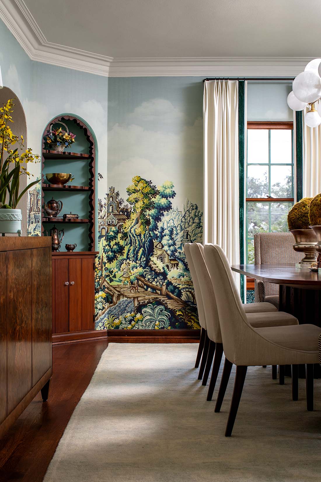
Transitional style carried us along for a while and allowed us to ease into cool whites (and pale grays) without too much pain. Recent gorgeous examples, when done well (like so many featured here), are timeless, where you can’t tell if they were designed twenty years ago or now.

But then whites came on strong. For over a decade now (helped at first by the softer whites of modern farmhouse), white walls, white kitchens, and cool-toned colors have reigned supreme. I, for one, am thrilled that we’re no longer stuck in the dark Tuscan caves of decades past! Lighter spaces have lifted us psychologically, liberated us from a narrowly-defined brown-based color palette, and served as the perfect backdrop to bring in fresher, more saturated colors like emerald greens or bold blues.
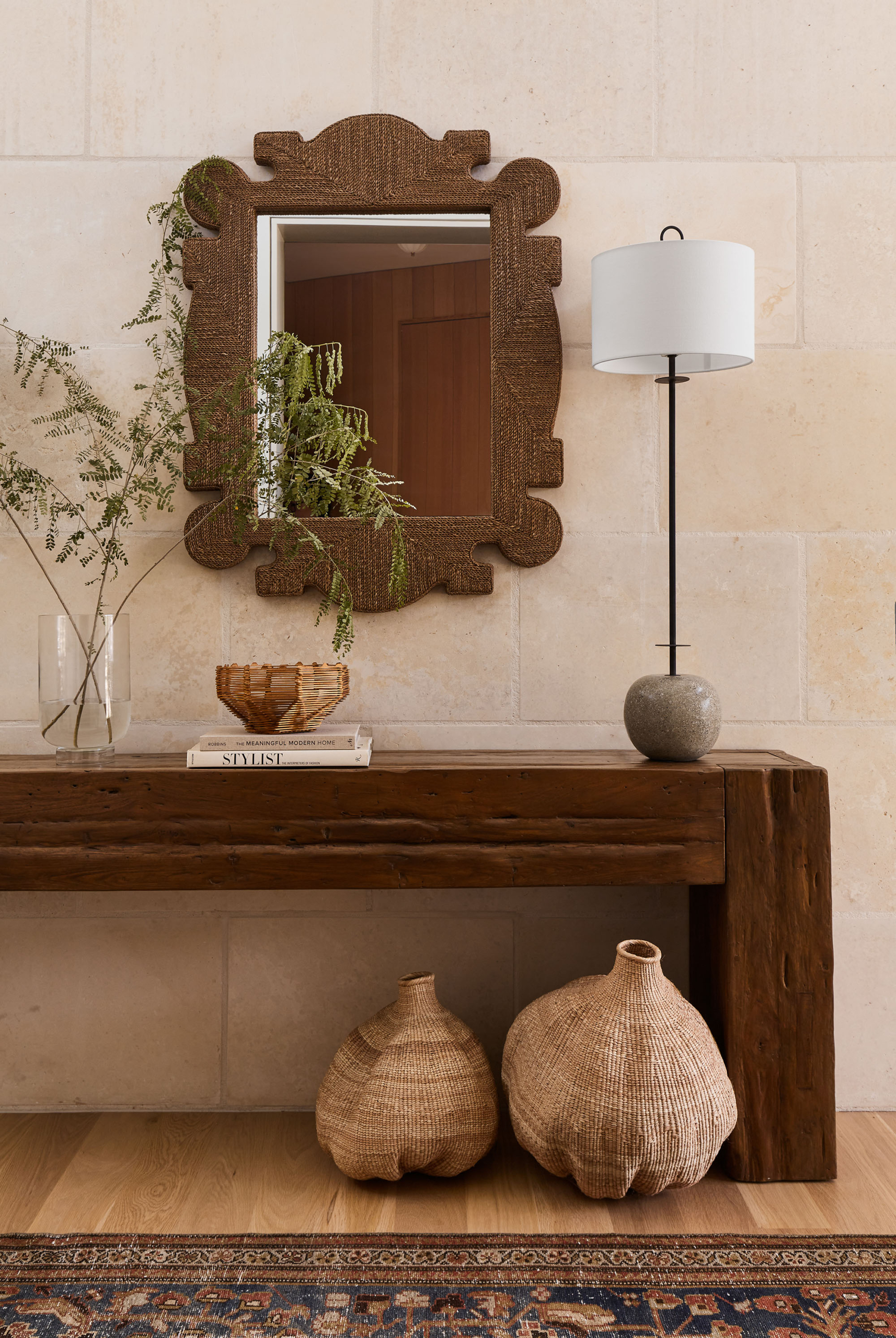
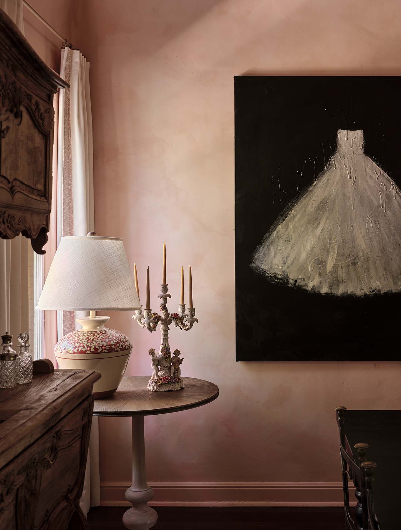
With design trends constantly on the move, we’re now seeing the return of cream, beige, and long-forgotten tones such as pale terra-cotta reds, earthy pinks, and warm greens. You may have spotted the English cabinet maker DeVol‘s stunning European kitchens with their deep muted colors, or blogs like this one by Austin-based designer Anastasia Casey, discussing a move away from cool whites. What does this all mean for you?

Use soft, warm tones but keep the overall effect light

One easy way to do this is to keep your ceilings white. Unless you have serious design skills, few of us can pull off an all-tan or all-brown room without it looking like a Tuscan cave that never got updated. As long as your existing whites aren’t too cool and have a touch of warmth, you can layer in warmer neutrals and they’ll still go together, without tipping over into an all-tan or all-brown color scheme.
Make sure you have plenty of natural light. Part of the charm of spaces like this kitchen below is that richer, creamier tones become moody and atmospheric when bathed in soft sunlight. (By the way, kitchens seem to lend themselves well to transitional style, since the addition of stained wood pieces or painting the cabinetry in a beige or other warm neutral has such a big impact.)

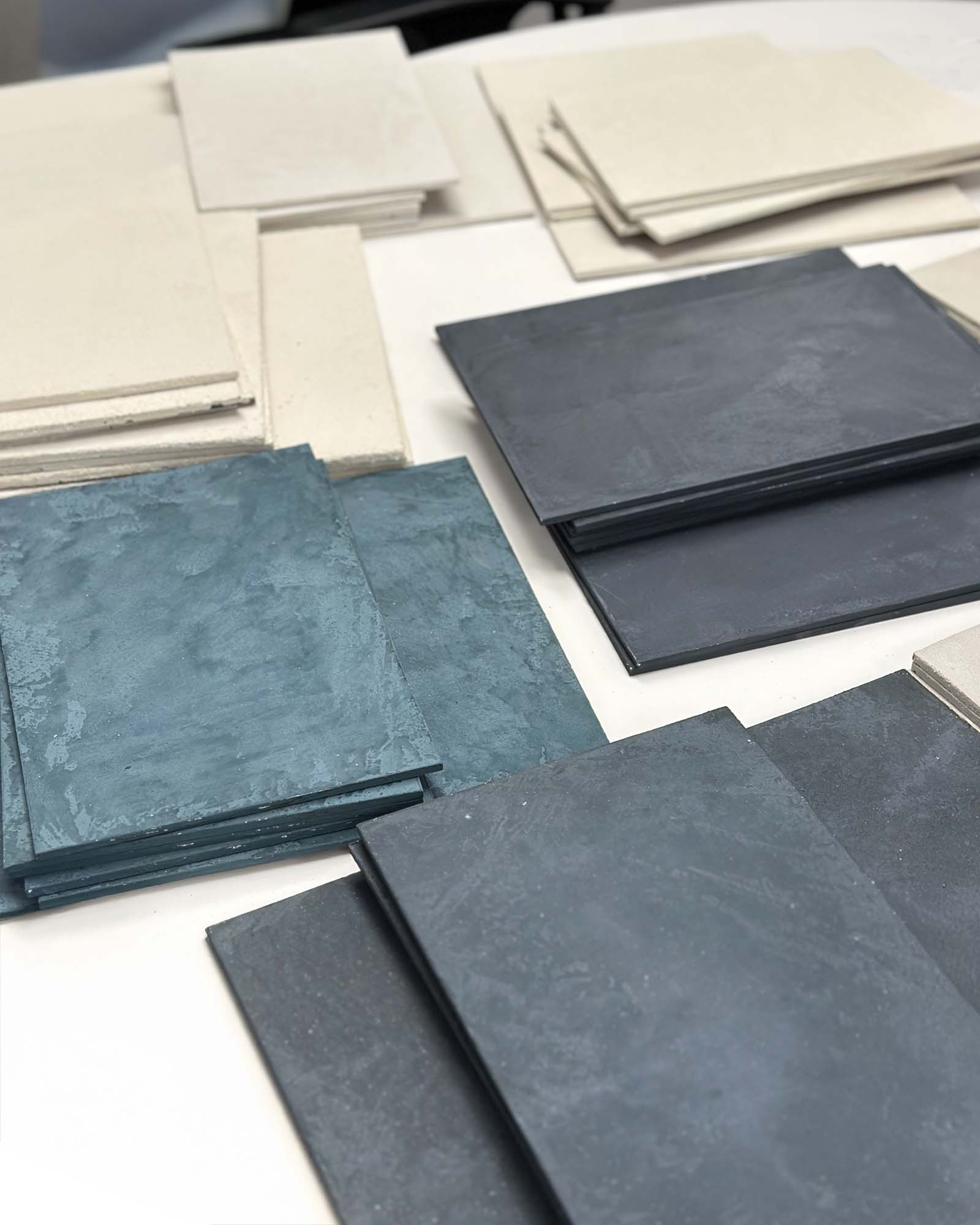
The soft, warm neutrals we’re seeing now aren’t quite as heavy on the “warmth” as before. You’ll see more green-beige than gold, for example, and also the return of “greige”, a gray-beige blend. Overall, the light neutrals in vogue now are cooler and less saturated than during the first Tuscan-to-transitional phase.

And finally, current interiors have retained a more clean-lined aesthetic (unless they’re classically full-on traditional). We’re not going back to the fringed draperies and ornate wrought iron of Tuscan style anytime soon. Resist letting that pendulum swing all the way back to heavy traditional style unless you have a clear design vision! Go nice and easy in your transition back into transitional style (no pun intended), and your home will retain its freshness, while adding a cozy element of warmth and elegance to it.


