
After seeing light, fresh interiors everywhere in stores, on HGTV, and in your friends’ houses, you’re ready to freshen up your home, especially if it’s still in what we call the “Brown Phase” of the past few decades. You’ll be moving out of the Dark Ages – literally! But you’re unsure how to begin. Cream or beige seems safe enough, but you also see different accent colors everywhere – blue chairs, white-and-orange rugs, yellow ceramic lamps. Do you need to use those colors too?? Will your home be boring otherwise? Decorating with cream and gray seems like it should be straightforward . . . but if you’re hesitating or unsure where to start, there’s a simple reason for this:
.
Although (or maybe because) it was so limiting, the Brown Phase was easy.
.
You probably had tan walls and area rugs, sofa and chairs in tan fabric or dark brown leather, and a wooden coffee table. Other than “earth tones” (tan or brown and their metallic relative, bronze), the only colors you were allowed were burgundy, gold, and a warm, sage green:

.
Your home’s hard surfaces were “earth-toned” natural materials like stained oak cabinets, granite counters, and travertine tile – all variations of brown or (even worse) orange.

While this color scheme was certainly safe, it made interiors dark and didn’t suit the color preferences of many of us.
.
Remember the old 80’s trend of “getting your colors done” for wardrobe choices? Only redheads look good in warm tones! Most of us don’t look good in browns, and yet we surrounded ourselves with this color at home. But the saving grace of an earth-toned color palette was that it is very easy to put together, even for novices. All you had to do was trust your builder with the choice of a tan for the walls, and everything else (from the granite counters to the leather sofa) just fell into place!
.
Now, how do you even begin decorating with cream or gray when almost everything you own is brown??
.
A few points:
.
[dropcap color=”red” background=”grey” style=”circle” size=”big”]1.[/dropcap] First of all, let me assure you that it’s very hard to go wrong with a white/cream/gray color scheme.
.
For those of you who just need a little validation, let me officially provide it here! Just as you could assemble a whole house in various tans and browns and they would more or less go together, a room in creams and grays would do just fine. The only real complication is using a stark, cool white, which doesn’t always play well with its creamier cousins. But if you make sure your whites tend toward softer, warmer varieties (cream, beige, off-whites), you’ll do just fine. Trust me on this!
And if Paper Moon Painting is going to be your home painter on your project, we provide complimentary color consulting by our own fully-trained color consultants. Just to help take the stress out of choosing color!
.
[dropcap color=”red” background=”grey” style=”circle” size=”big”]2.[/dropcap] Second of all, don’t think that just because you love traditional style that you can’t decorate with cream and gray.
.
Here are some examples from our own interior painting projects, in addition to the one at the top of this post:


.
In each of these photos, the walls would’ve been painted tan during the Tuscan brown phase. Some of these photos lean more traditional and some more Modern Farmhouse or even Eclectic, but it’s not the furnishings that were updated so much as the wall color.
..
[dropcap color=”red” background=”grey” style=”circle” size=”big”]3.[/dropcap] And thirdly, you may already be halfway there, if you have lighter, fresher furnishings or flooring, or some good patterns or accent colors.
.
Here are some examples of “brown phase” rooms that really just need a fresh coat of paint to completely transform them!
First this one:

.
Here’s my Photoshopped mock-up, where ONLY the wall paint was changed:

It’s a whole new space!! (This is why I love what we do.) The seemingly outdated tan sofa and leather chair work great with a new, green-gray paint color. It helps that the rug and pillows insert just the right amount of pattern and contrast.
Here’s another example. This is the original:

And my mock-up, with a pink-beige paint color on the walls to match the undertone of the stone fireplace and pink-beige rug and sofa, and a lighter white on the ceiling:

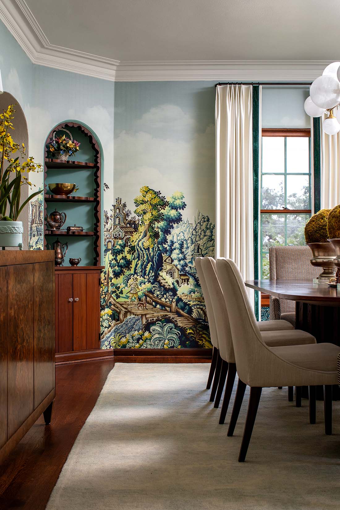
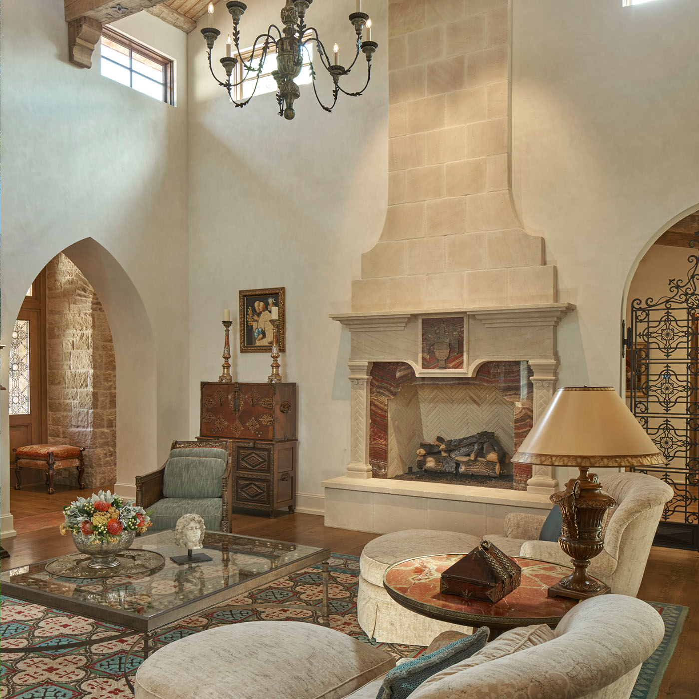
Why was just a new paint color enough to update this room? Because the accent colors (teal blue and gold) are current “enough” to work. That’s the beauty of the traditional living room in the title image at the top, which we plastered in a European plaster for Baxter Design Group in Alamo Heights, Texas. Here it is again – note that the accent color in the rug, chair, and throw pillows is a soft blue. If it had been dark red or burgundy, this room would look outdated instead:

Here’s one more little one, just because I could do this all day! Here’s the room before, looking oppressively “tan”:

And after a mock-up, where the only thing I did was lighten the wall color!

.
So don’t be afraid to paint those walls! The next phase after that would be working with color and contrast (read Maria Killam’s post that I link to below), but for “phase 1”, stick to decorating with cream, off-white and gray and you’ll have a pleasing monochromatic, elegant look. This is the underpinnings of the “modern farmhouse” look, by the way. You saw it popularized on the HGTV show “Fixer Upper”, and is the next evolution of “Texas Tuscan” or “Hill Country” style. But you don’t have to go in the Modern Farmhouse direction if you’d rather stay traditional! Just start with painting your walls, and maybe the ceilings if they were also tan or dark beige. I don’t just say that because we’re painters, but because walls and ceilings are your biggest surface area. The updated interiors above are great examples. (Soon as I can, I’m going to compile a list of favorite color options to post.) For now, suffice to say that as long as you stick to soft whites, beiges, and grays, you really can’t make a mistake!
.
[dropcap color=”red” background=”grey” style=”circle” size=”big”]I[/dropcap] really can’t explain it any better than Maria Killam does here, in her excellent blog post about how NOT to decorate around a dark neutral sofa. If you read through her extensive blog, you’ll get a complete education in how to transition from the heavy “Texas Tuscan” phase. You may spend several nights reading her archives, but it’s worth it! But start with the one I’ve listed above first.
.