When most of us think of our old college dorms, the term “boutique hotel vibe” doesn’t usually come to mind. That’s all changed with firms like LV Collective, who are revolutionizing student housing in gorgeous ways that don’t just look pretty, but foster a richer and more productive university experience.
Our interview with Chelsea Kloss
We can’t think of a better example that the stunning new complex known as the Yugo Austin Waterloo, right next door to the University of Texas at Austin. We were thrilled to ask lead designer Chelsea Kloss about her design process! (All photos by Chase Daniel Photo, commercial wallpaper installation by Paper Moon Painting.)

Paper Moon: Chelsea Kloss and the LV design team did an amazing job designing this new residential tower, incorporating color and pattern and comfort in a fabulous way. Can you tell me a little about the design team that put it all together?
Chelsea Kloss: The initial concept was developed while I was still operating my own firm, but at the completion I had joined forces full time with LV Collective. This allowed me the opportunity to engage other designers to join me in the LV Studio and complete the final touches of the project. Payton DeMarco came on board, after having recently graduated with an Interior Design degree from Texas Tech, and was instrumental in curating the wallpaper collection.
PM: What was the overall theme or vision that you landed on when the design process got underway?
CK: We always talk about “energy per square foot®” and the idea that mindful design really drives the experience. We opt to create impactful, well-appointed spaces that really pack a punch and deliver high levels of energetic vibration.
We also wanted to create spaces that drew students from their private residences and enticed them to engage with their neighbors in the common amenity areas, so that all corners of the building were activated. Through design, we set the stage for moments and interactions, in hopes that our design choices will foster the creation of relationships and memories.

“Rinse and repeat” is a no-no in our studio! To us, every bathroom, every study nook, every corner is an opportunity to feature a unique design moment.
PM: There are lots of unique public spaces in this building, from eating areas to study nooks to group work tables, each with its own striking features and distinct flavor. How did you ensure that all the spaces would flow together and be part of a unified whole, without sacrificing the distinctness of each?
CK: Mood boards are a great way to get a sanity check on how a variety of materials will ultimately interact with each other in a collective space. It’s amazing how quickly you can see if a product is a good fit by simply dropping it onto a digital mood board with other finishes.
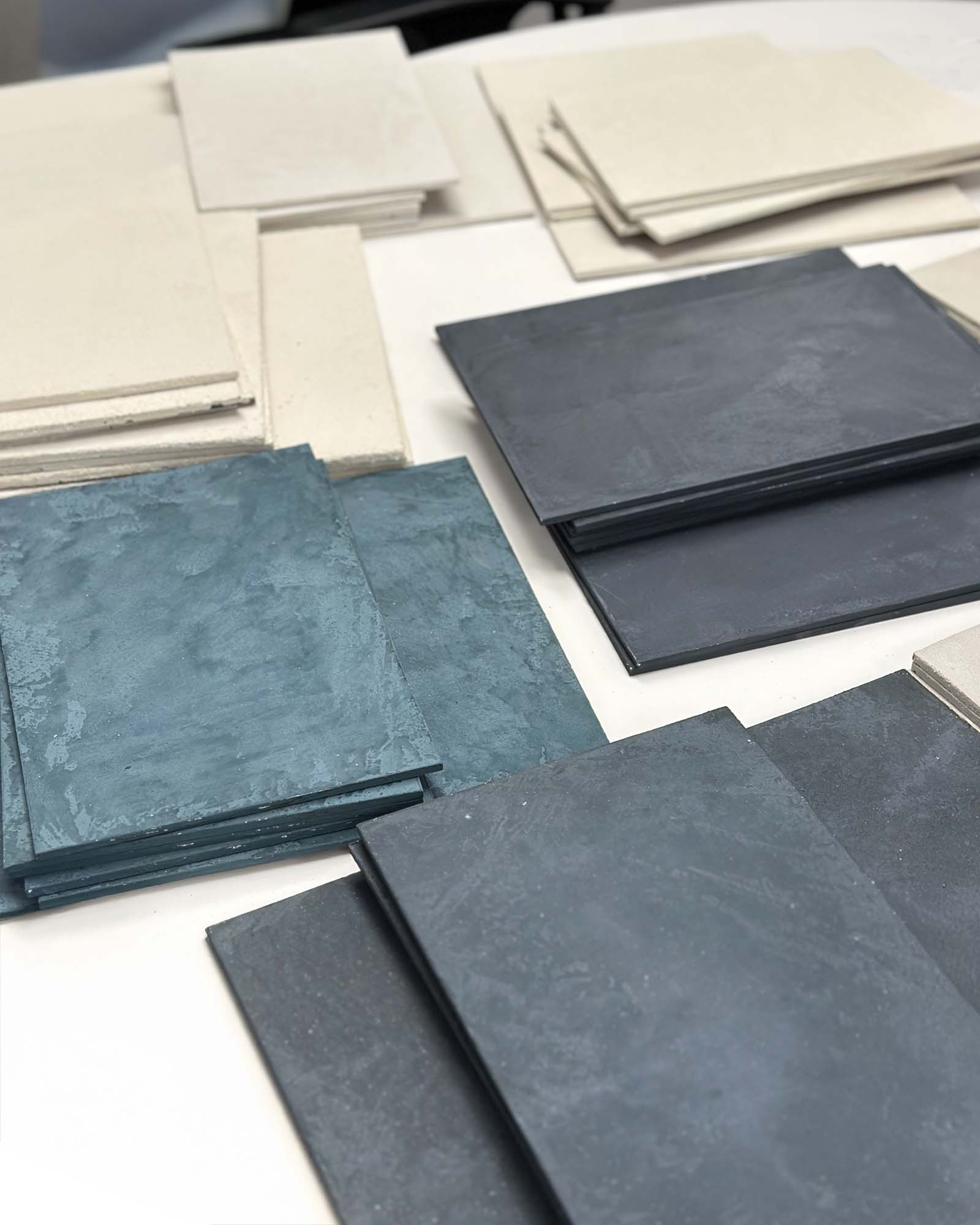
We also get physical samples of all of our selections and lay them out on a large table to ensure that the design story feels cohesive across the board. The materiality should feel like parts of a whole, such that the areas are “siblings, but not twins” when it comes to their individual aesthetic. We don’t want to give anyone whiplash by having too many underlying design concepts, but rather, we want to foster a familiarity as you travel through the space.

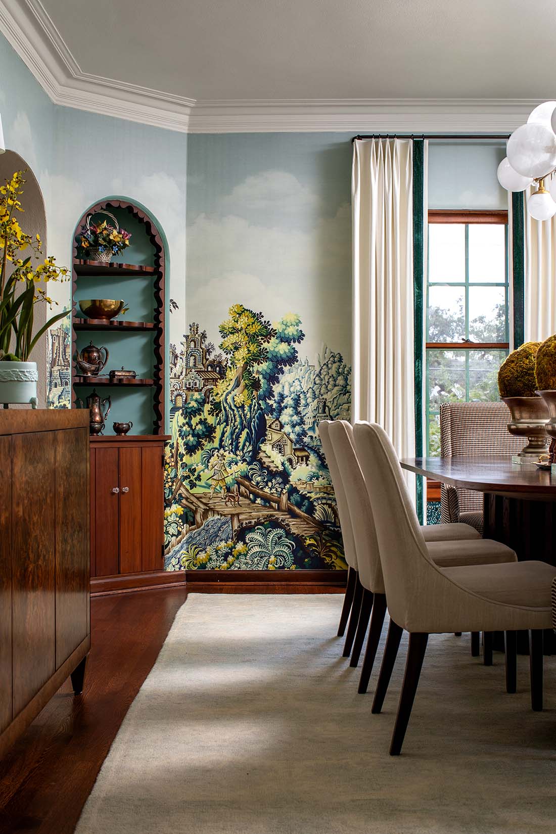
When it came to wallpaper, one of the ways that we were able to harness consistency, while still offering individuality by area, was to use papers from a single artist. Kristy Stafford was our shining star, and by tapping her work for a lot of the shared spaces, we felt confident that the color story and overall patterning would tie together well.

PM: How did your design process evolve for these spaces? Did you need to modify your vision as you went along?
CK: Surprisingly, a majority of the original concepts were implemented as designed. As with any project, there were a few hiccups with discontinued selections, but we like to believe that always opens the door to a fresher, even better solution.

One example of a change that we made later in the game was the color of the bookcase in the coffee/study area. We opted to pivot to Sherwin Williams’ color of the year “Urbane Bronze“, because we thought it would be a great way to leverage a current design trend in the project.
PM: What were some of the hardest design decisions you had to make?
CK: The larger the space, the more difficult it is for me to initially tackle. Like eating an elephant, you can’t take it all in one bite, so I try to carve off smaller areas and start getting traction in that way. This typically helps with the intimidation of the sheer number of selections that have to be made in those bigger areas and starts laying the groundwork for the design story that will ultimately come through in each area.

In the main lobby space, we started with the living area and put blinders on in relation to the other adjacent areas. The fireplace tile, lighting and general furniture concepts came together and then helped inform the direction for the nearby stairwell and entry.

PM: Any special considerations needed for a residential tower that would house very busy (and maybe distracted) college students?
CK: It was important to design for both social and introspective moments throughout the amenity offering. Larger, open environments are punctuated with smaller, compressed seating arrangements. There is a push and pull throughout the spaces which gives residents flexibility in how they want to leverage each space.

We worked closely with our student interns and other UT students to understand what they really wanted, and needed, out of the space. We never want to take a “check the box” approach to design, but instead want to curate a space that the students will really use.
PM: The residential tower has a great balance of communal work areas combined with private nooks where someone can tuck in with their books and laptop. How did you ensure that both the quiet, individual studiers and the more social, group-oriented students each would find the right place for them?

CK: We lean into the idea of “together but separate”, meaning that we wanted to provide students the ability to feel connected to the community while still drilling down on their academic practices. From enclosed, acoustically buffered conference rooms to open air library tables and study nooks, we provide the students with a variety of experiences that cater to every study style. We appreciate the diversity of the student population and we wanted to design with all study behaviors in mind.
PM: The outdoor spaces – especially the rooftop pool – are gorgeous as well. Did they present their own challenges?

CK: Walking out on the thirtieth floor can be an intimidating and vulnerable feeling simply from a scale perspective, in addition to social challenges. The canopy of the building offered a little compression, to bring the human scale back into play. We chose to design the shape of the pool in such a way that smaller conversation nooks were created around the perimeter for more intimate gatherings. While the views were incredible, we intentionally wanted to focus the energy back into the center of the pool deck, and leveraged warm materials like the Ipe pool decking and plush furniture to soften the aesthetic.
PM: Which details in these projects are you most proud of?
CK: I’m most proud of the cohesive message that permeates through the entire building envelope. It’s easy to lose momentum with the scale of these spaces, but our team did an incredible job of retaining the attention to detail through and through. That last ten percent of a project, the styling, is also critical and our team continues to really excel in that.

PM: Any takeaways from this project that a homeowner could successfully incorporate in their own home?
CK: Wallpaper can be a great starting place to curate the design story for a space. If you need a catalyst or a spark to get a design concept moving, consider starting with your wallpaper. From that, you can pull in other color components or patterning to compliment that. I like to say that there are a lot of things to be afraid of in this world, but color isn’t one of them! Allow yourself to be adventurous with color and pattern, and if you just want to dip a toe in the water, start with a small space like a powder bathroom or home office.

PM: Any other thoughts?
CK: At LV Collective, we all believe that design is the vehicle by which experience is delivered. Every aspect of the space, from the way it looks and smells, to the music you hear and the way you feel in the space, can contribute to the overall success of a project. Interior Design is about so much more than pretty spaces. It’s about setting the stage to allow the real magic of life to happen.
PM Perfectly said!
You can see additional photos from this stunning project in our hospitality and commercial wallpaper gallery. And we here at Paper Moon are thrilled to see a boutique hotel vibe in today’s student housing, saving a new generation of college students from the stodgy dorms of the past!


