If you love chinoiserie wallpaper and French or NOLA style, interior designer Crystal Sinclair shares your passion. Just look at the sophisticated elegance she recently brought to two San Antonio, Texas restaurants. Paper Moon Painting installed the wallcoverings in these beautiful establishments (UpScale and Restaurant Claudine), and we asked Crystal about her design process and what challenges she encountered along the way.

Our interview with Crystal Sinclair
Paper Moon: You’ve infused these San Antonio restaurants with a sense of both sophisticated luxury, and comfortable lounging and relaxation. What are some of the challenges of designing for restaurants in particular?
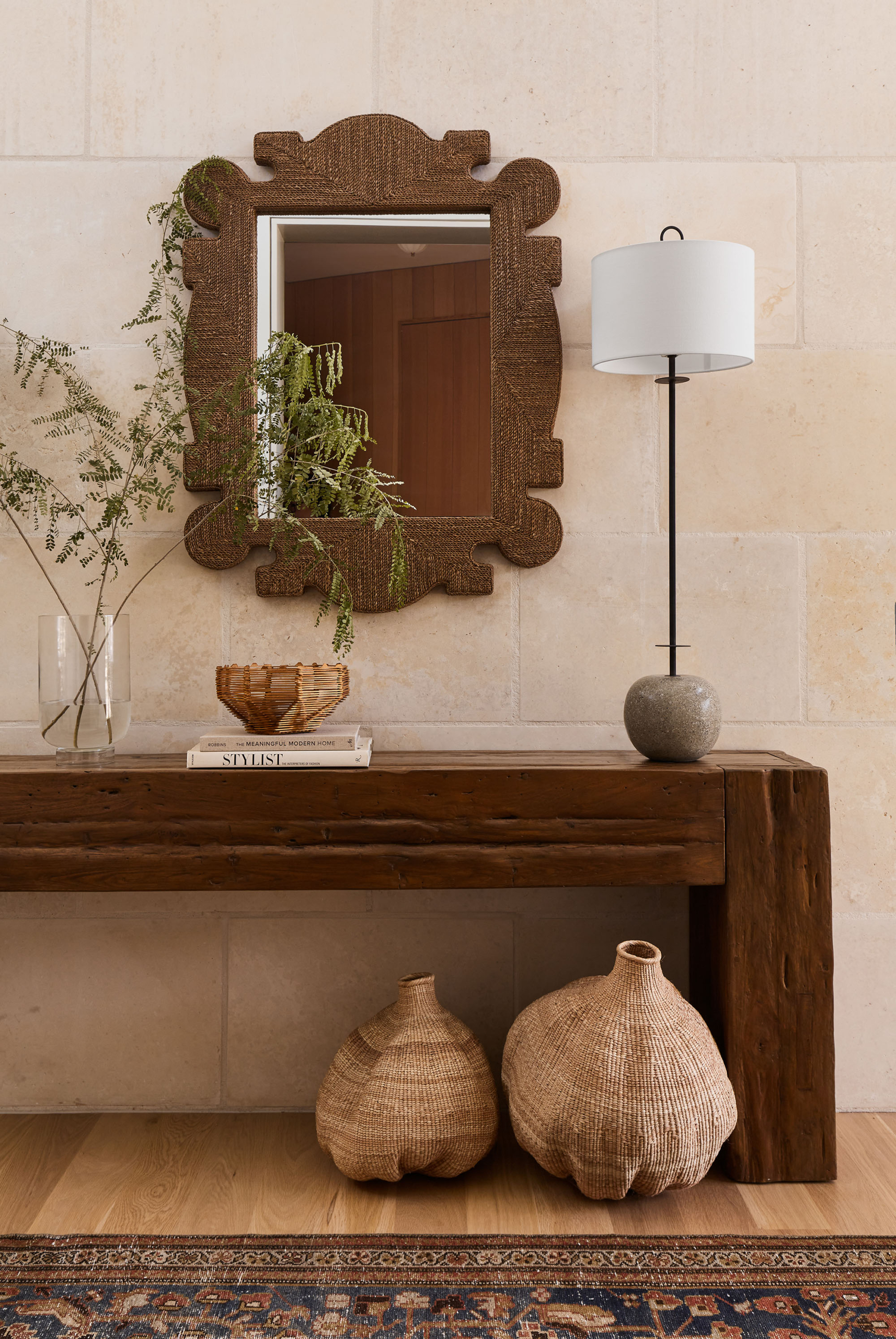
Crystal: Public dining spaces have to function a bit differently than how a home would. Commercial spaces will see more abuse (wear and tear) than a typical residence we might design, so material selections are important, while still making sure everything looks and feels comfortable. Visually, we are always about layers, and that’s no different with a restaurant space. We plan each corner and each wall carefully – including the fifth wall, the ceiling! Vintage sourcing wherever possible really creates a unique space with a more personal feel, which in turn feels more comfortable.
The design vision
PM: How did your design process evolve for these spaces? Did you need to modify your vision as you went along?
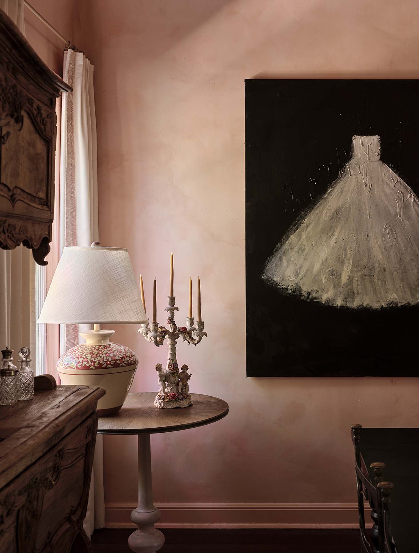
Crystal: For both restaurants, we had a concept in mind from the beginning, and we were able to flesh out the design pretty quickly for most of the spaces. However, in Restaurant Claudine, the front entry room took a bit longer to nail. We played with a lot of different colors – there are three rooms that flow off of this one, so we had to be careful of color here. Once we landed on a rich, muted pink for the millwork and ceiling that could be echoed in other spaces, the room came together quickly!


“We plan each corner and each wall carefully – including the fifth wall, the ceiling!”
PM: What were some of the hardest design decisions you had to make?
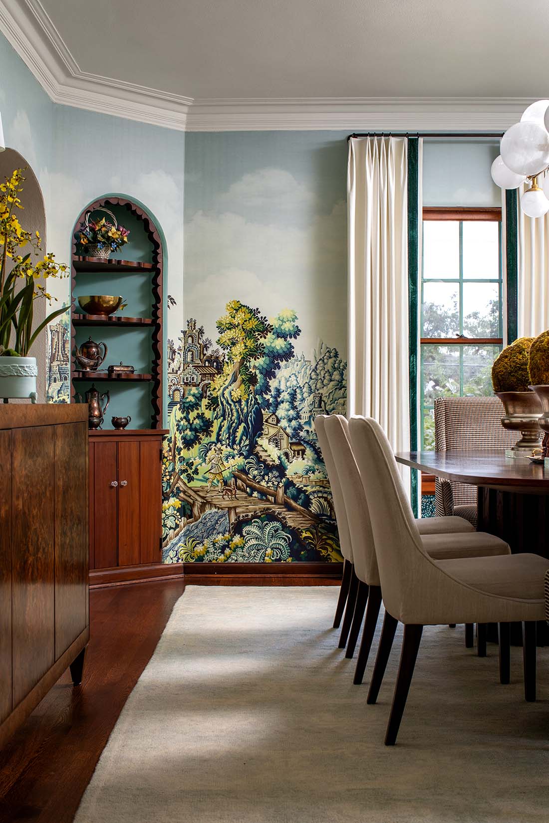
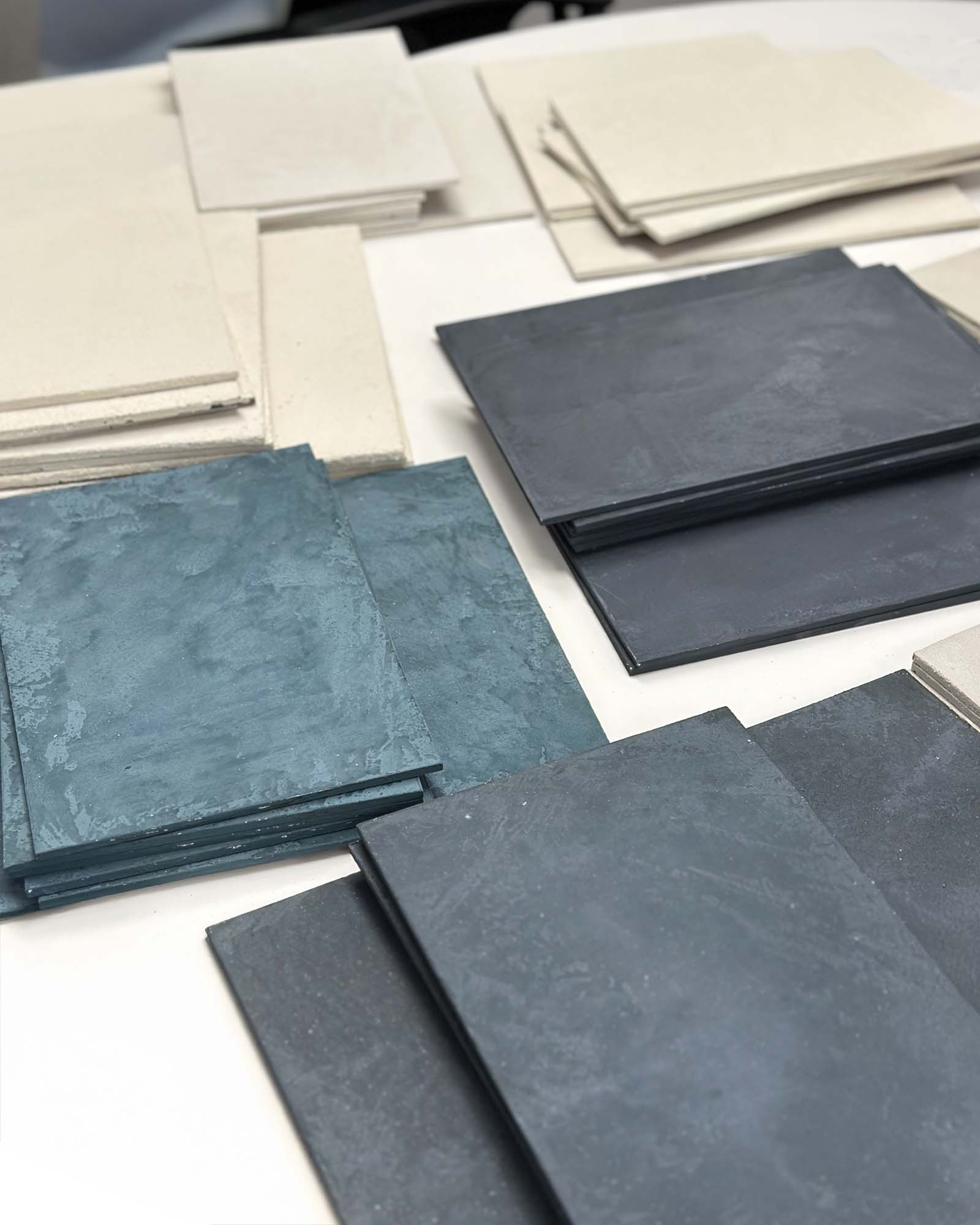
Crystal: The chinoiserie wallpaper in the private dining room, with the coral curtains, was incredibly difficult to source. We knew we wanted a muted, dark green color for the wallpapered walls but it took us a while to find the right tone. We finally landed on a wallpaper by Nauzha and we love it! The other design element that took some trial-and-error was the accent color for the restroom tile, to play off the stunning House of Hackney “Hollyhocks” wallpaper without competing with it. In both cases, patience and perseverance really paid off.


The challenges of older homes or buildings
PM: Both of these restaurants are in older buildings – in the case of Restaurant Claudine, a 100-year-old home that had never housed a commercial kitchen or public eating area before. Any unique challenges there?
Crystal: The spaces in an older home are smaller, not originally intended for a large-scale dining experience. Restaurant Claudine was more cut up into rooms than UpScale, which has a larger space. We had to make each room feel larger and more grand than it actually is. Playing with scale, especially with draperies and lighting, really helped us achieve this.
The other restaurant, UpScale, wasn’t quite so tight on space but still had its limitations. Using lighting inventively and playing with ceiling heights (mainly around the bar) really helped add interest and create the right vibe. Plus at UpScale, we were able to have more fun with the seating, whereas for Restaurant Claudine’s layout, we were limited because of space and window placement.


Using chinoiserie wallpaper
PM: You used colorful chinoiserie wallpaper in both restaurants, to great effect. What led you to those wallcoverings in particular?
Crystal: When the owners of Restaurant Claudine specified they wanted a French NOLA feel, chinoiserie wallpaper instantly made sense. For UpScale, I had stumbled across a fabulous pink wallpaper during the design phase and knew I wanted to incorporate it somewhere – thus the garden room was born!
“We used lots of rich, saturated color. We went bold and it worked great!!”


PM: Which details in these projects are you most proud of?
Crystal: Oooh, good question! For UpScale, it’s definitely the entire bar area, especially the liquor cabinets, deciding to drop the ceiling, and adding the pleating around the dropped ceiling itself for a high-end touch. For Restaurant Claudine, it’s the colors! We used lots of rich, saturated color, which designers sometimes shy away from. We went bold and it worked great!!


Advice for homeowners
PM: What advice would you give a homeowner who wants to incorporate similar design elements (especially classic, colorful wallpapers) into their own space?
Crystal: Select a nice, well-crafted wallpaper – be careful, there are some really bad versions out there. The iconic Gracie Studios and DeGournay are both well-known for chinoiserie wallpaper, and their collections are phenomenal. Make sure you work the wallpaper’s colors into the overall space – either by pulling out an individual color to repeat elsewhere in the room, or by working with a carefully-selected contrast color. Consider adding moldings, and never forget the ceiling! 🙂
PM: Thank you so much!! One last question – how can people reach you?
Crystal: Email us at [email protected], or find us on Instagram at @crystalsinclairdesigns.
For project photos of chinoiserie wallpaper and other gorgeous wallcoverings, browse our residential and commercial wallpaper galleries, and don’t miss our baby and child nursery wallpaper gallery!


