When it comes to dining room design, just buying a nice table and chairs isn’t enough. Yet because the function of a dining room is so standardized, many homeowners get a coordinated dining set, add a plant in the corner and some art on the wall and call it a day.
This kind of generic approach won’t do for Austin-based designer Cyndi Hopkins of Cyndi Hopkins Design. As part of the team that helped Cyndi bring her vision to life, we were curious about how she injected such a personalized, “modern luxe” style into this blank canvas of a space. We also love how she used warm, sophisticated earth tones to perfection. Read on for her best advice on dining room design in general, and on what makes this space feel so rich and organic! (All photos by Matthew Niemann Photography.)
How this dining room design evolved

Paper Moon: Cyndi, this space is so richly layered and coordinated, it stops you in your tracks the minute you walk in the door! Can you tell us about the home overall? What aesthetic did you and your client decide upon?
Cyndi: This is a beautiful custom home that my clients have lived in for ten years. At the builder’s suggestion, they included cabinetry on one wall of the dining room, but they didn’t need all the storage space, and the vibe felt bland and utilitarian. Their front entry and dining space lacked any personality whatsoever, and so they rarely used the spaces. Usually they bypassed the front entry entirely, opting to use the entrance off the courtyard most often to welcome family and friends.
My client was very organized at our first meeting. She had a few pictures of spaces she loved, and she had brought a small decorative object made of wood and shells to show her love of the outdoors.
PM: How did you translate that aesthetic into this particular space? You blended textural elements inspired by your client, and added sophisticated details and colors to end up with an ” organic meets modern luxe” style.
CH: That’s exactly what we were going for! Often in the initial meeting my mind is flooded with ideas – it is the most enjoyable part of the design process for me. The minute I saw the homeowner’s decorative piece, I immediately thought of this fantastic oversized floral grasscloth, and how I could bring some whimsy into the dining room design experience.
Design “must-haves”, especially lighting
PM: What were some “must-haves”, either from a function or design standpoint?
CH: The lighting desperately needed attention. Rarely do builders – even custom home builders! – allocate enough budget for lighting. Thus the lighting is often underwhelming, poorly scaled for the space, and overly matchy.
Lighting can really punch up individuality and add drama, so I worked with the client to develop a layered lighting approach. We added statement lighting to the standard recessed lights throughout the home, and selected and customized pieces that were almost works of art. It was also a great way to bring elements that were organic in nature, and reinforce other natural elements in the design. Whether in the form of sconces that resembled shells or hanging light fixtures that look like flowers, the lighting was chosen for its sculptural quality.

PM: What design elements did you keep, and what did you know needed to be reworked?
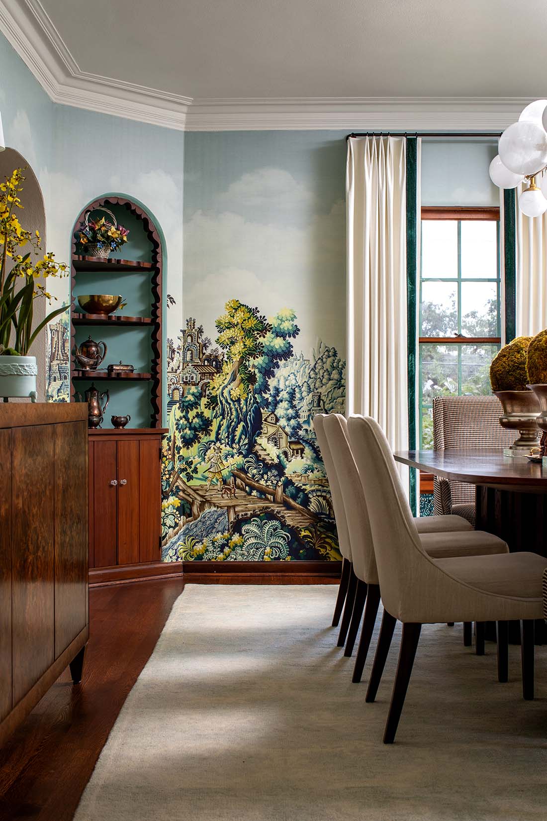
CH: The first critical decision was what to do with the built-in cabinetry on the main dining room wall. We considered removing it, but I suggested we keep the built-ins and rework them to get a different look entirely, without the time, cost and inconvenience of a remodel project.
We removed the upper cabinet doors, leaving the lower doors on for storage. After painting the cabinets a rich, muted green and extending the wallcovering on the walls onto the backs of the built-ins, we now had plenty of shelves and a unique opportunity for decor that would infuse the space with personality – and prompt some fun dinner conversations!

The wallpapered ceiling
PM: Your color selections are so sophisticated. How did you begin?
CH: The first pattern selected was this fantastic oversize floral grasscloth by Phillip Jeffries, and all the subsequent colors were pulled from there. Because they were all earthy and muted, I opted for a lot of texture in the fabrics, art and accessories. The polished brass creates a nice contrast and is repeated through the decor, hardware and lighting.
PM: The wallpapered ceiling is phenomenal.
CH: I’m so happy to hear that. I love making use of the “fifth wall”, and a wallpapered ceiling is one of my favorite ways to do so. It is bold, unexpected, and your neighbor probably doesn’t have one!
Plus it’s a great option when you aren’t sure about committing to wallpaper. It is only one wall so the expense is less, both for the cost of the wallpaper and for its installation. For people that might be intimidated by an entire room of pattern, wallpapering just the ceiling creates more than enough impact.

PM: Any advice for someone who is considering putting wallpaper on their own ceiling?
CH: Pick something you love and go for it! You won’t be disappointed.
PM: I have to ask about that stunning light fixture!
CH: It really is a work of art, pictures don’t fully capture the beauty of it. This fixture is all hand-blown glass, reminiscent of a blossom with ruffled layers.
My first experience with this fixture was at a trade show over a year ago. There was a single blossom piece laying on a table, that I picked up and held in my hand. I was immediately captured by the beauty and intricacy of the glass. I just waited until the right opportunity to use it, and I believe we found the perfect place.
As a bonus, the fixture is hinged at each joint, so there are many options to customize its positioning. We choose to place the blossoms in both upward and downward positions, to cast light on the gorgeous ceiling as well as on the table, which is necessary in good dining room design.

Designing the butler’s pantry
PM: You also converted the adjoining butler’s pantry into a home bar. It’s a lovely little jewel of a space. Besides its small size, what other challenges did you encounter when designing it?
CH: The space was definitely a challenge, it’s barely four feet wide! We leaned into its compactness and layered in plenty of detail. It really is the epitome of modern luxe style. We installed the small-print wallpaper and painted the cabinets, including the door and casing of the pantry opposite so that it all coordinated. This was all quite a bit outside of my client’s comfort zone, but she ended up loving it. Custom hardware by Modern Matter and some layered staging made the space truly feel like a jewel box.
The other challenge was that this space is directly adjacent to the home’s kitchen, which is light and bright. We worried that between the showstopper dining room and the spacious kitchen, this little space in the middle would be ignored. Happily it worked out because the butler’s pantry has enough moxie to stand on its own!

Why the homeowner loves this modern luxe style
PM: As we return to the dining room, what is the homeowner’s favorite thing about it? And what are you especially proud of?

CH: I have so many favorites in this space. Most definitely, I’d say the ceiling and the lighting. And I loved being able to include decor items that are carefully curated but also extremely personal to me. For example, I purchased some hand-thrown pottery in St. John specifically for this family. It is featured in the display area but is meant for use. Those details make the space special to the family, and let me leave my own unique fingerprints on the dining room design.
As for the homeowner, she loves that the space reflects her personality and feeds her soul. This is a wonderful space in the morning with sunlight streaming in. My client loves to plan her day here. Every morning, she sits at the head of the table where the window looks out over her garden. This isn’t just good dining room design, it’s what good interior design is meant to do, to help the home’s residents feel relaxed and inspired, without even being aware of the design behind it.


