We recently painted the cabinets for designer Chelsea Evans’ own warm modern kitchen update, and were thrilled to see the final result. We sat down with Chelsea to ask about her design process, her paint color choices, and why that old 1950’s wallpaper didn’t scare her off!
Our interview with Chelsea Evans
Paper Moon: When you bought the home, the kitchen had some very “retro” design features (and not in a good way). What were your initial thoughts?

Chelsea Evans: I definitely saw past the not-so-desirable features of the kitchen and could appreciate the tall ceilings and wonderful windows. I was excited about the potential of the space for sure.
My initial thoughts were that my “eye” was bouncing all around the room and didn’t know where to land visually. The wallpaper would draw your eye, but that wasn’t necessarily the area I wanted people to focus on. The tall angled windows were great, but the big fluorescent light blocked it from most angles. So, my first order of business was streamlining and making sure the features I wanted to highlight took center stage.

Designing a warm, modern kitchen
PM: How did your design process come together? Did you envision this lovely warm modern kitchen from the get-go, or did it evolve over time?
CE: I think I had a pretty clear vision of what I wanted right away. I knew I’d be keeping the cabinets because they were in great shape and the layout worked well for us, but the paint was chipping and all-white wasn’t really my style. The brownish mustard-y yellow cabinet paint color we selected was a must-have for me.
I also knew I wanted soapstone for my counters, and that I’d be removing things from the kitchen so the windows could be more of a focal point. I found the chandelier over the island early in the design process, which has brass, leather, and walnut. That helped solidify some of my other design decisions along the way.
Design challenges
PM: What were some of the hardest design decisions you had to make?
CE: We faced the usual challenges we all do lately, with shipping delays, rising costs, and long lead times. Some of the hardest decisions were just whether or not I should stick to my original design and wait for items, or if I needed to start from scratch and find alternatives. I ultimately ended up keeping everything as planned and just waited. The chandelier I mentioned kept getting delayed and took nearly a year to come in, but I felt it was important enough to be patient. I definitely empathize with my clients because I have been there and know what it’s like to wait, but sometimes it’s totally worth it to hold out! I’m glad I did.

Specialty lighting
PM: Your lighting is pretty spectacular! That outdated light box in the center definitely had to go.
CE: Yes, we removed it ourselves. My husband is the king of the ratchet strap, haha! He’s moved literal boulders and cement water cisterns with ratchet straps. The light box that held the fluorescent light was made of solid wood and it was very heavy. It was attached to the ceiling with four chains. We hooked a strap to each chain and slowly lowered them down, little by little, one corner at a time until it was resting on the countertop. Then, the two of us carried it out and disposed of it. It immediately opened the kitchen up!
Using several different paint colors
PM: You use three different colors on your cabinets, which works perfectly for a warm modern kitchen update like this one. How did you come to choose those colors?


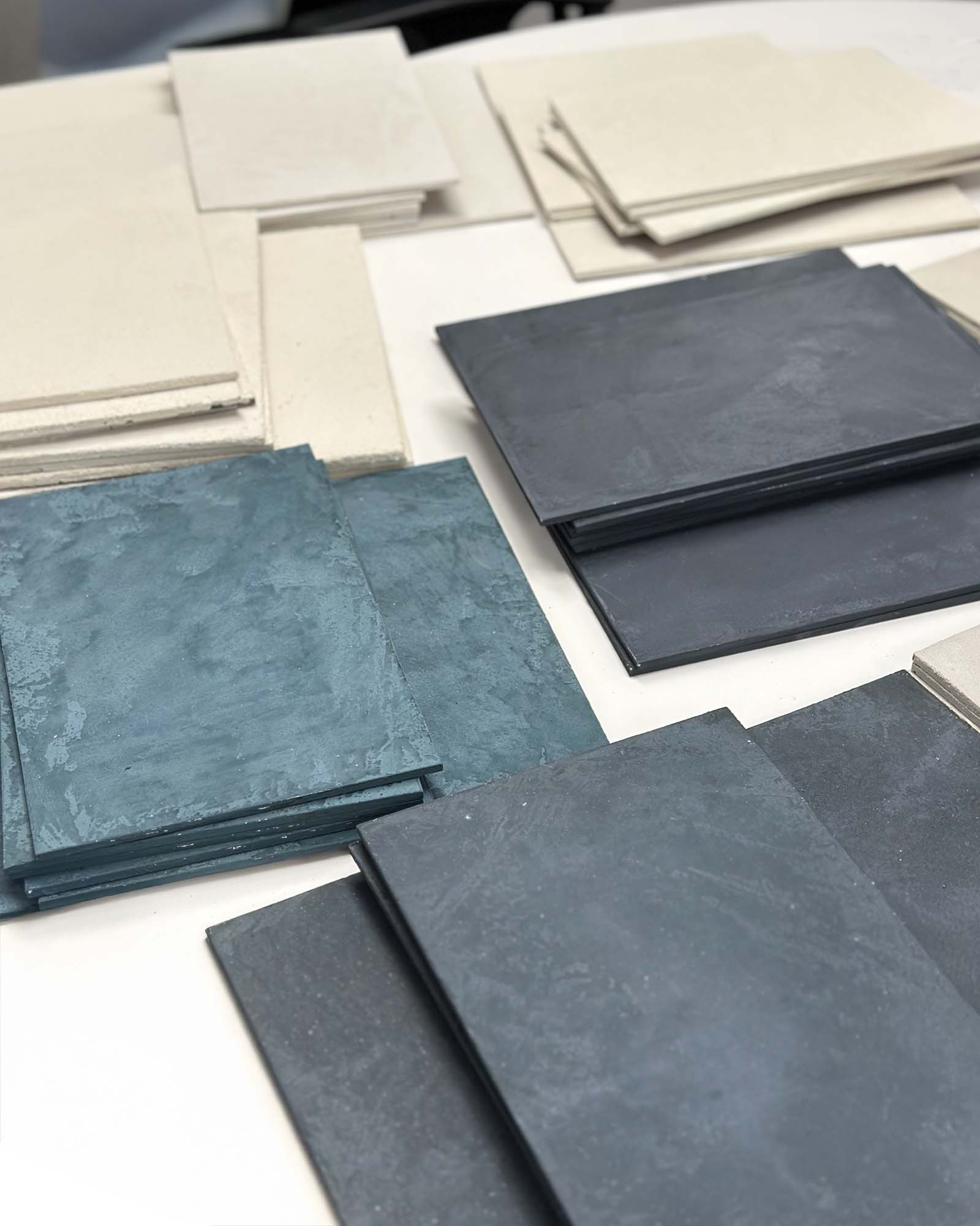
CE: I had a clear vision in my mind of which yellow color should go on the perimeter cabinets. I narrowed the yellow colors down from my paint swatch fan decks and ordered some samples from Samplize. They sell peel-and-stick paint samples in larger sheets so you can stick them to the surface you’re planning to paint, and you can remove and stick them again and again.
I kept the samples in place for months while we finished up other projects in the kitchen. The longer the sample stuck to my cabinet, the more I fell in love. I couldn’t find a single project online that showed the color I’d selected, so I was both excited and nervous to see how it would come together in real life.
The island color I’ve used before in other spaces, and I thought it paired really well with the soapstone slab I chose. And lastly, I chose a crisp white for the upper cabinets and the oven tower because I wanted them to fade into the background.
PM: Which element of your renovated kitchen fills you with the most joy?
CE: That’s so hard to answer! I’m happy to report that the two things I wasn’t willing to budge on in the design (yellow cabinet color and soapstone counters) are probably my favorite fixed features in the room. It also brings me a lot of joy to have the little “keeping room” in the kitchen, because friends and family actually use the lounge chairs regularly to have a drink and chat with me while I cook!
Probably the thing I am most grateful for daily are the open shelves which display all my handmade and vintage pieces. A good chunk of what’s displayed are from local makers. Some pieces are even made by myself or my husband, or by personal friends. The remainder are vintage, thrifted, and/or purchased from local small businesses.

Advice to homeowners
PM: You had quite a task here, to be able to see past the outdated finishes to envision a gorgeous result. What advice would you give to anyone facing a similar design challenge?
CE: Mood/vision boards don’t have to be complicated, and they will help with visualizing how each component will work together in the bigger picture. A vision board can be as simple as a Word Doc that you copy and paste photos into.
Getting physical samples of the items you plan to use is really helpful too, and I suggest taking them with you any time you’re shopping so you can see everything in front of you all at once. Make sure to take samples home and see them in natural light before ordering, because unfortunately most showrooms have harsh fluorescent light fixtures. Colors appear totally different under different lighting! I also recommend homeowners live in a space before they renovate, if they can. I know it’s not always possible, but that will help them know whether or not their current layout functions for them.
PM: Any other thoughts?
CE: Making a house feel like a home takes time. I say that often, to anyone who’s willing to listen, because I think it’s in our culture to want immediate results. Our kitchen renovation took a year to complete, and I have no regrets about taking my time, making each decision thoughtfully.
Really putting thought into how you live, what works for you, what doesn’t work for you, and making a space feel uniquely “yours” is well worth the time and effort. As they say, “You can have fast and good, but not cheap. You can have cheap and good, but not fast. And you can have fast and cheap, but it likely won’t be good.” Don’t rush the process, especially in a room like a kitchen. You want to make sure it’s not only beautiful, but also functions really well for your day-to-day life, and you will still love it for years to come.

PM: One last question – how can people reach you?
CE: I’m on Instagram as @chelseaevansdesigns, or there’s my website, www.chelseaevansdesigns.com
PM: Thank you so much for sharing your wonderful kitchen! I’m sure you’ll enjoy many warm memories in such a refreshing and happy space.
CE: My pleasure!!


