If you’re updating your home and picking paint color (or maybe tile or flooring as well), you’ve probably browsed online for some inspiration and color ideas. But that’s only the starting point. Finding photos on Instagram or Pinterest can point you in the right direction, but you’ll need to do a little more homework to find out if the color in that stunning Luxe Magazine spread is right for your own living room or kitchen.
Photos posted online are almost always edited first. That means they’re not ideal for picking paint color.
When it comes to color, online photos can inadvertently be misleading. Why? Because they’re almost always edited to look beautiful in some way, and the editing process inevitably changes the color ever so slightly.
Whether online or in a book or magazine, photos of gorgeous spaces won’t give you an accurate read on the color, because they’re not meant to. Most interior design images are meant to show a project to perfection, showcase the designer’s skill, and inspire viewers to want the same for themselves.
Therefore, almost all photos meant for sharing and publication get edited or Photoshopped. This is not out of a desire to mislead, but because images rarely get downloaded from the camera looking perfect.
- The light levels might be off – like when a room looks too dark because of the bright sunlight outside the window.
- The colors might not be accurate – maybe the reflected light bouncing off the lush trees outside is casting a green tint on your white cabinets.
- Something might be in the shot that doesn’t belong. (Power cords especially.)
Even quick, unedited snapshots won’t give you a good color read. Cell phone images are the worst, because the camera assumes that the scene has an equal amount of lights and darks, so if you’re photographing a mostly-white interior, the image will be automatically darkened by the camera to show more of a mid-range. Unedited photos are fine for your kid’s soccer game, but if you’re showing off a room you just designed or a kitchen you just painted, some editing is required, especially in brightness and color rendition.
Here are some examples from our own projects, so you can see the dilemma of relying on photos alone when picking paint color.

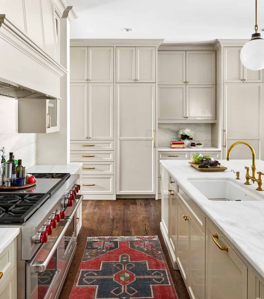
We painted this lovely kitchen using Sherwin Williams “Amazing Gray” on the cabinets. Here’s my unedited snapshot, plus a screen shot of the color for the paint manufacturer’s website.
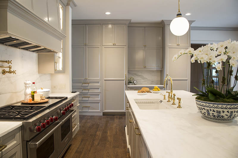

All the white surfaces in the foreground make the cabinets in the background look way too dark. The only place the cabinets look remotely like the paint color screen shot is on the shadowed part of the island – and even there the tone is off (the paint chip looks greener). The phone snapshot may be unedited reality, but it is not a good depiction of how the kitchen actually looks. And this photo is certainly not publishable.
The professional photos are so much better, and have been edited with finesse. They look gorgeous, but they aren’t enough when you’re trying to figure out how to pick paint color for your own kitchen.
Sometimes, you’ll see a paint color photographed in two different spaces, and the color looks very different in each one. In these two kitchens, the paint color on both of the islands is Benjamin Moore “Hale Navy“.


Which is more accurate? Which gives you an idea of what color to use in your own kitchen?
Remember – online photos are not the best way to judge color, especially when selecting paint for your home! You need to sample the colors in your own home, but more on that later. First, a corny analogy. . .
We wouldn’t commit to marrying someone we had only met online, without meeting them and spending time with them in person. You may fall in love with someone’s bio and have great email conversations, but before you commit to anything permanent, you have to meet that great candidate in person and spend some time together.
Think of online photos as the “bio” of the colors used. Just like actual dating profiles, online photos are meant to show the space to its best advantage. Unless you bring that color home, so to speak, you won’t know how it looks in your space. You’ve gotta evaluate that candidate in your own house.
Take a look at these two photos of the same space, both taken on different days but in natural light:
If I were looking for a soft white and if the paint color were known from these photos, I’d be very surprised when this same color looks so different in my own house.
One more set of comparison photos. Both of the bedrooms below were painted in Sherwin Williams “Underseas“, a cool, muted green.


These two rooms are in the same home, but both the natural and artificial light sources make the same paint color look different in each.
So how do you evaluate colors properly when you’re picking paint color??
You’ll need to use actual color samples or paint chips, and see them in your own space. Don’t shortcut this process! It’s pretty straightforward – we show you how at the bottom of this post. And of course, hiring an interior designer to help with color and materials selections is always a good idea.
Picking paint color can be a maddening process, but if you don’t rely just on internet photos, you’ll have a much better shot at success.